The Well Coffeehouse
BRAND IDENTITY & PACKAGING
The Well Coffeehouse, based in Nashville, approached us at a pivotal moment of growth. As competition in the market intensified and their business was looking to expand, they needed a refreshed identity that could elevate their brand and reflect the quality of their offerings. Beyond aesthetics, our goal was to build a brand system that honored their distinctive mission of Turning Coffee into Water—a powerful commitment to funding clean water wells and addressing safe water needs across the globe. Through the rebrand, we sought not only to raise the perception of The Well Coffeehouse as a premium destination, but also to place their purpose-driven impact at the forefront, ensuring their story of connection, community, and global change was celebrated and clearly communicated.

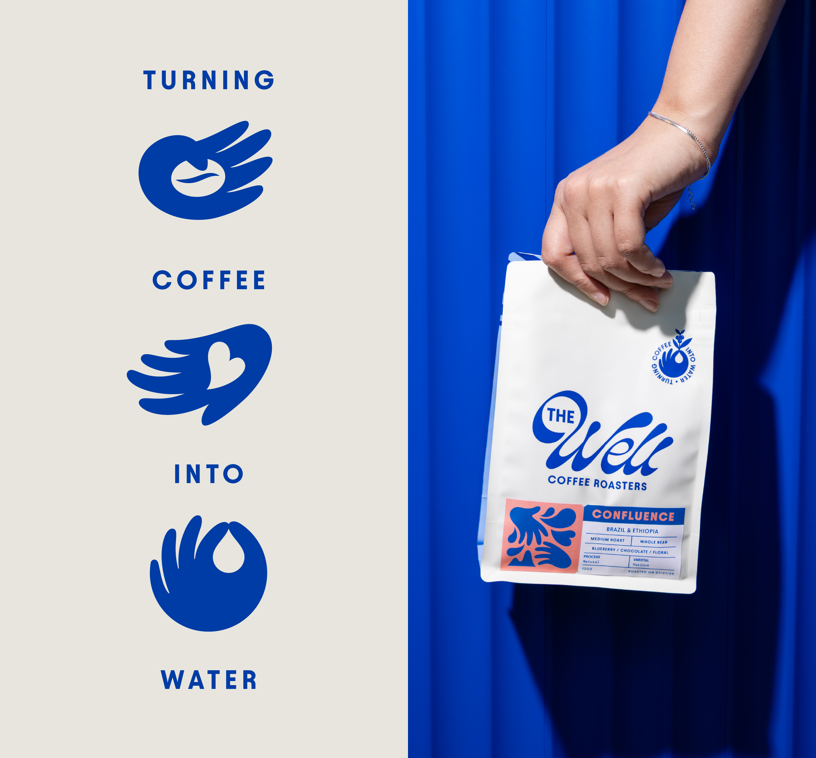
A large part of strategy behind the new brand identity was defining their mission: Turning Coffee into Water. We set out to build a visual system that makes this story tangible and unmistakable. The brand’s visual library is deliberately fluid, drawing inspiration from the movement and life-giving qualities of water. From the logo marks to the supporting icons, every element was designed to reflect the transformation that occurs when a simple cup of coffee fuels access to clean water around the world. What was once a vague or secondary idea is now placed at the heart of the brand—reminding audiences that The Well Coffeehouse was founded with a clear purpose and an unwavering passion to create meaningful global impact.


“Carpenter Collective is an incredible team with unbelievable design talent and a practical approach to execution. They guided us through our rebrand with creativity, clarity, and care, helping us bring our mission of turning coffee into water to life in a way that was both inspiring and enjoyable. We’re proud of the results, grateful for their partnership, and would definitely work with them again.”

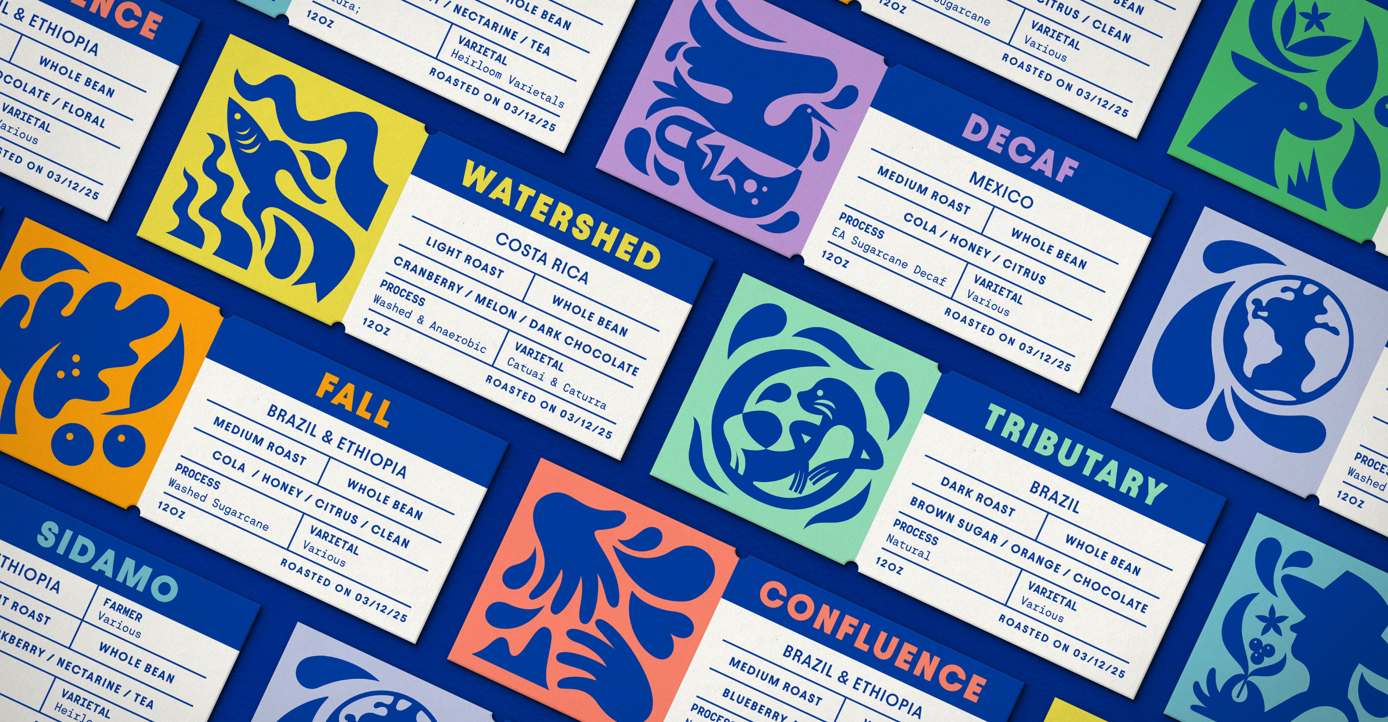
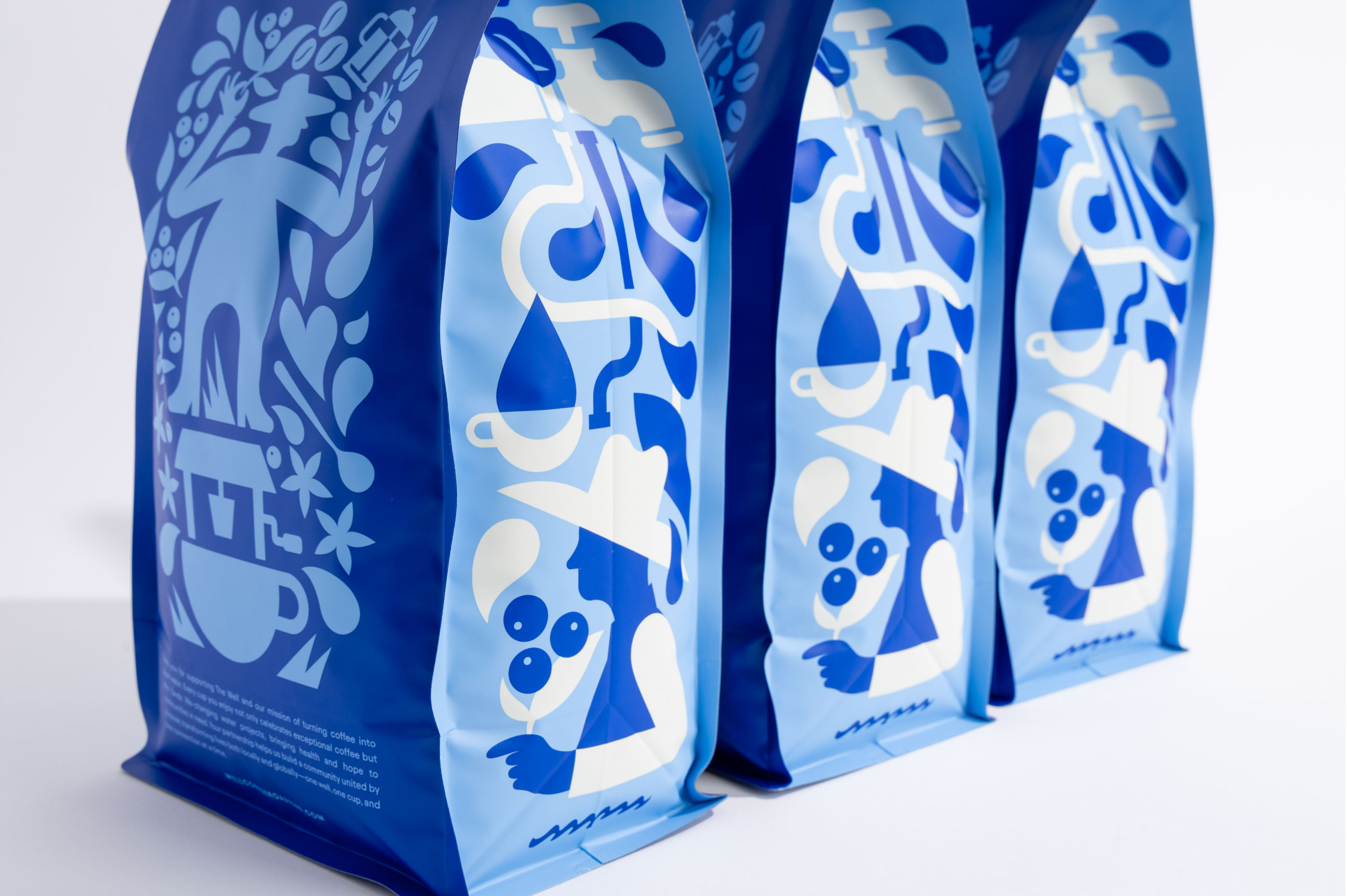
We developed a custom label system to ensure each roast not only stood out on the shelf, but also carried a story of its own. Every roast was given a distinctive color palette paired with a unique icon, designed to capture the character, origin, and spirit of that particular coffee. This approach created a labeling system that was as intentional and artful as the roasts themselves, making it easier for customers to recognize their favorites while elevating the overall brand experience with a sense of craft and personality.
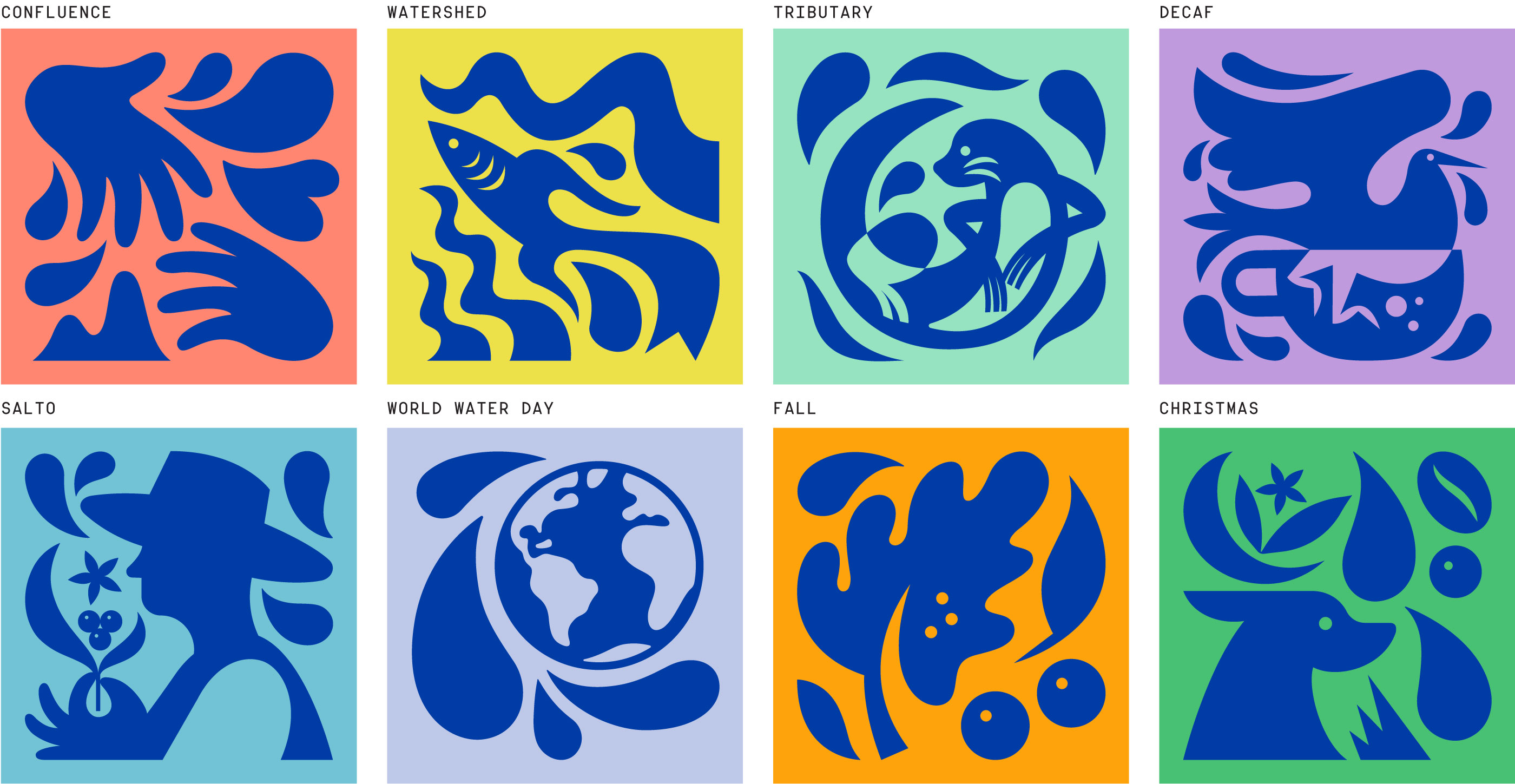
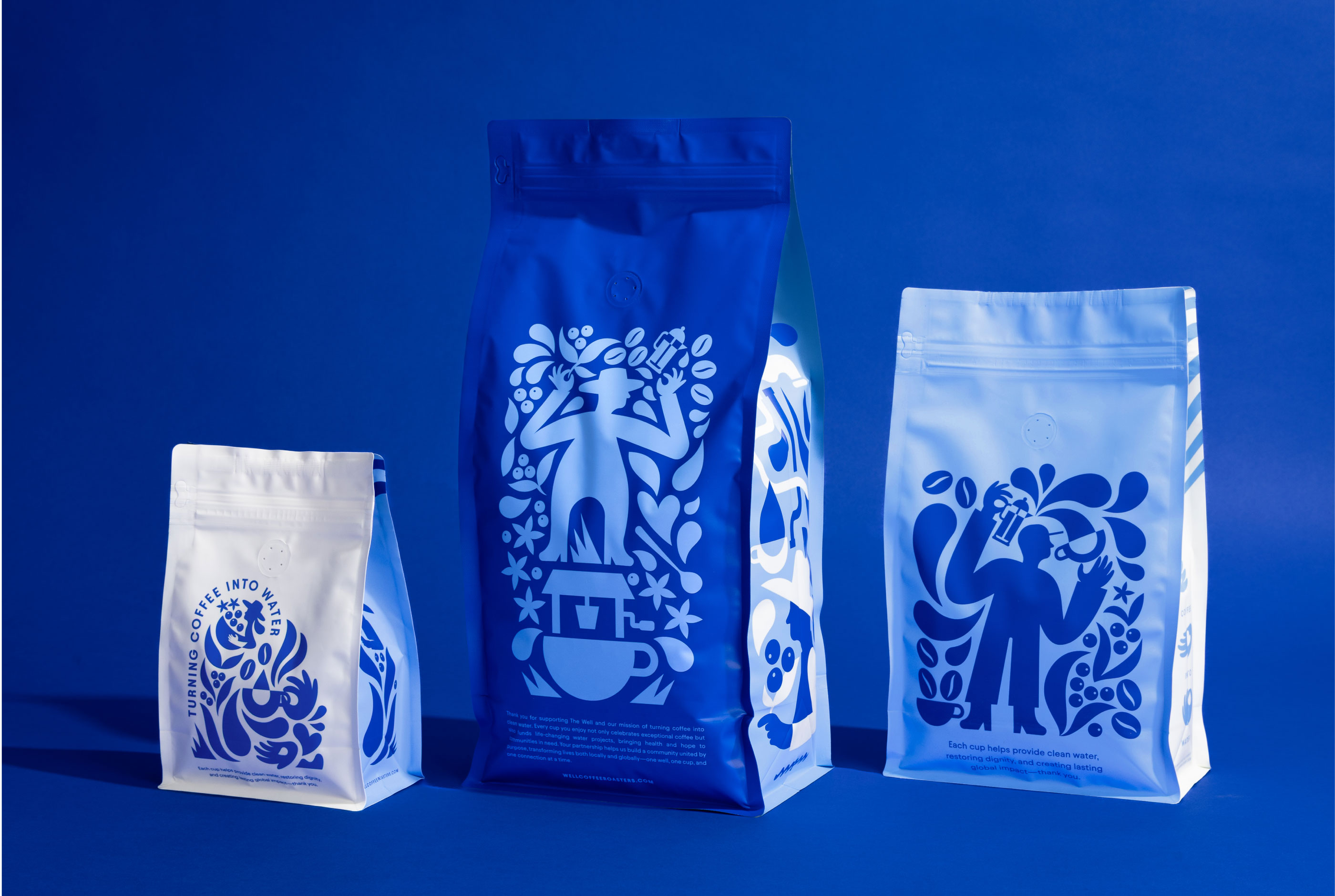
To bring The Well’s new identity to life, we developed a series of graphic illustrated vignettes designed to work seamlessly within the refreshed color palette. These illustrations celebrate the many people who shape The Well’s story—coffee farmers, roasters, baristas, water partners, and coffee lovers alike. While the coffee itself remains the hero, the brand places an even greater value on its people: the team, guests, and communities it serves. The illustrations act as a reminder that every cup begins with human connection. To reinforce this narrative, each coffee bag features a unique vignette on its back panel, ensuring that the brand’s mission and the individuals who make it possible are always front and center.


“With The Well Coffeehouse’s core message of Turning Coffee into Water, our team drew inspiration directly from water itself. From the illustration library to patterning to the custom wordmark, every element of the visual identity reflects the movement, fluidity, and life-giving properties of water.”
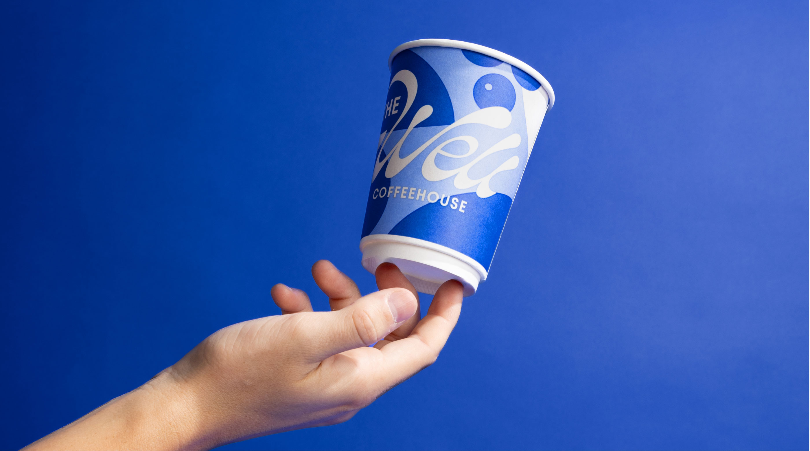


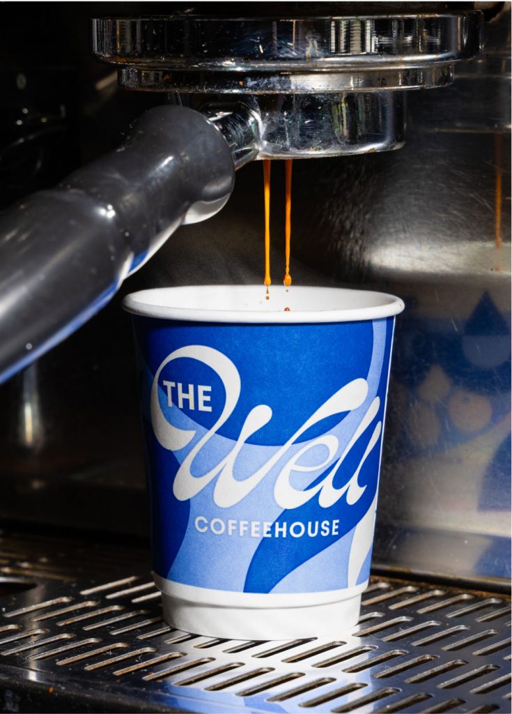
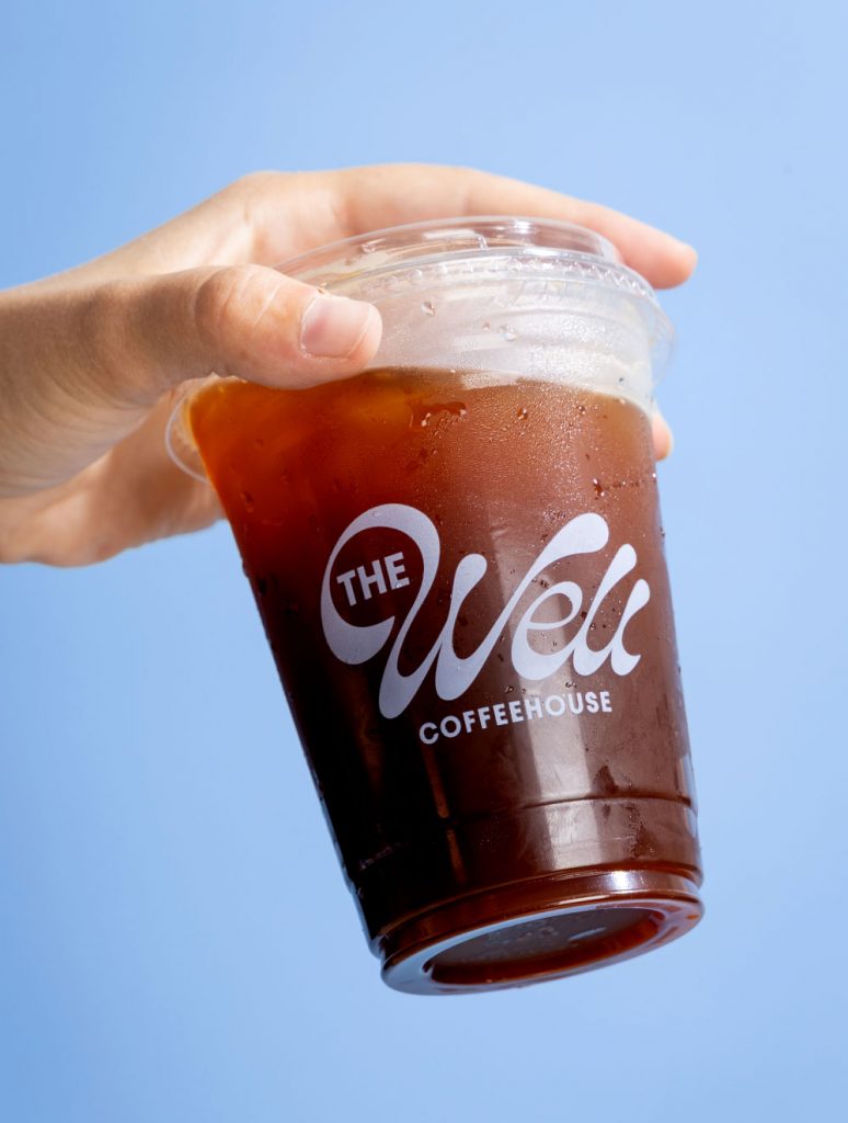
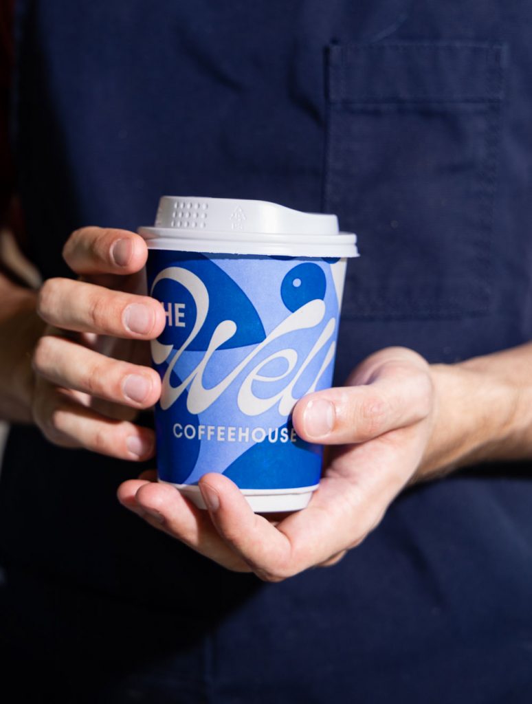
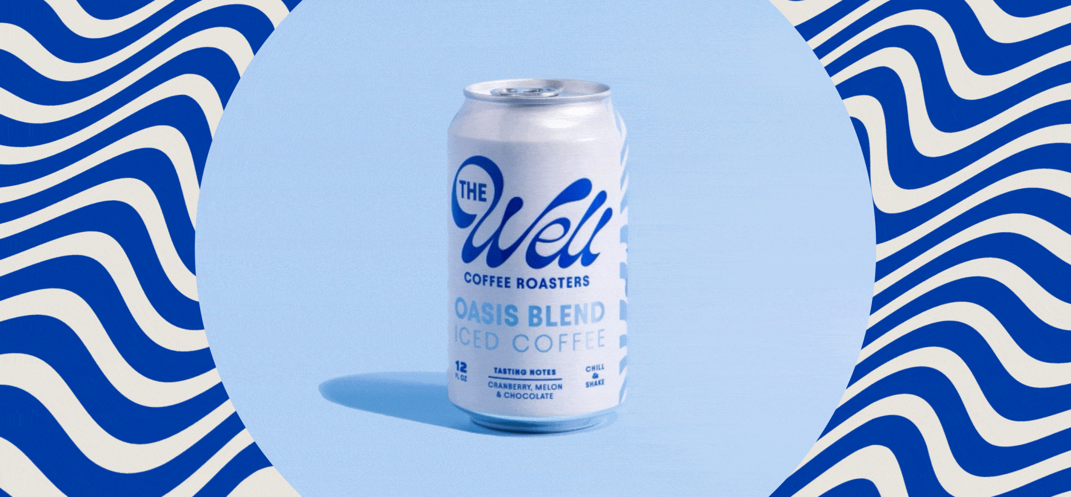
When extending the brand to to-go cups, cans, and retail packaging, our goal was to create touchpoints that function as both practical vessels and powerful mobile billboards. Each piece was designed to amplify brand visibility as customers carry them into the world, transforming everyday moments into opportunities for storytelling and recognition. The three to-go cup sizes each feature their own distinctive design, showcasing the flexibility and richness of the brand system while remaining instantly identifiable. The can design, though purposefully different to stand apart in its own category, was crafted to integrate seamlessly within the larger visual language—ensuring that every expression of the brand feels cohesive, intentional, and unmistakably The Well.


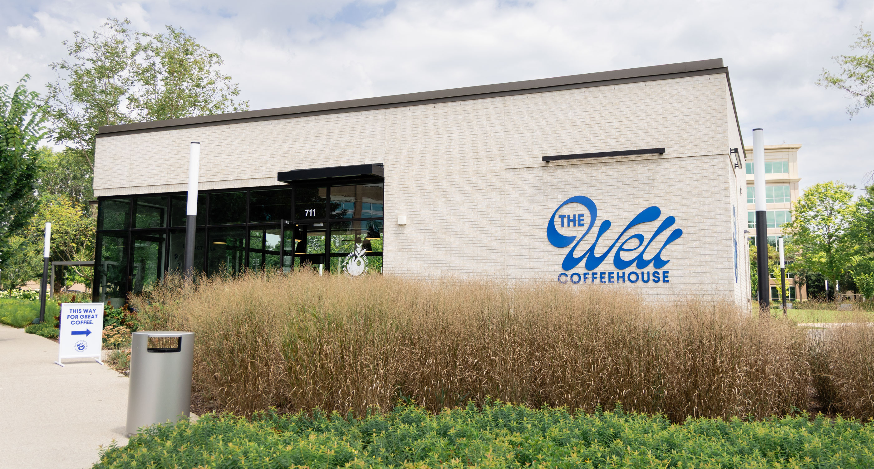

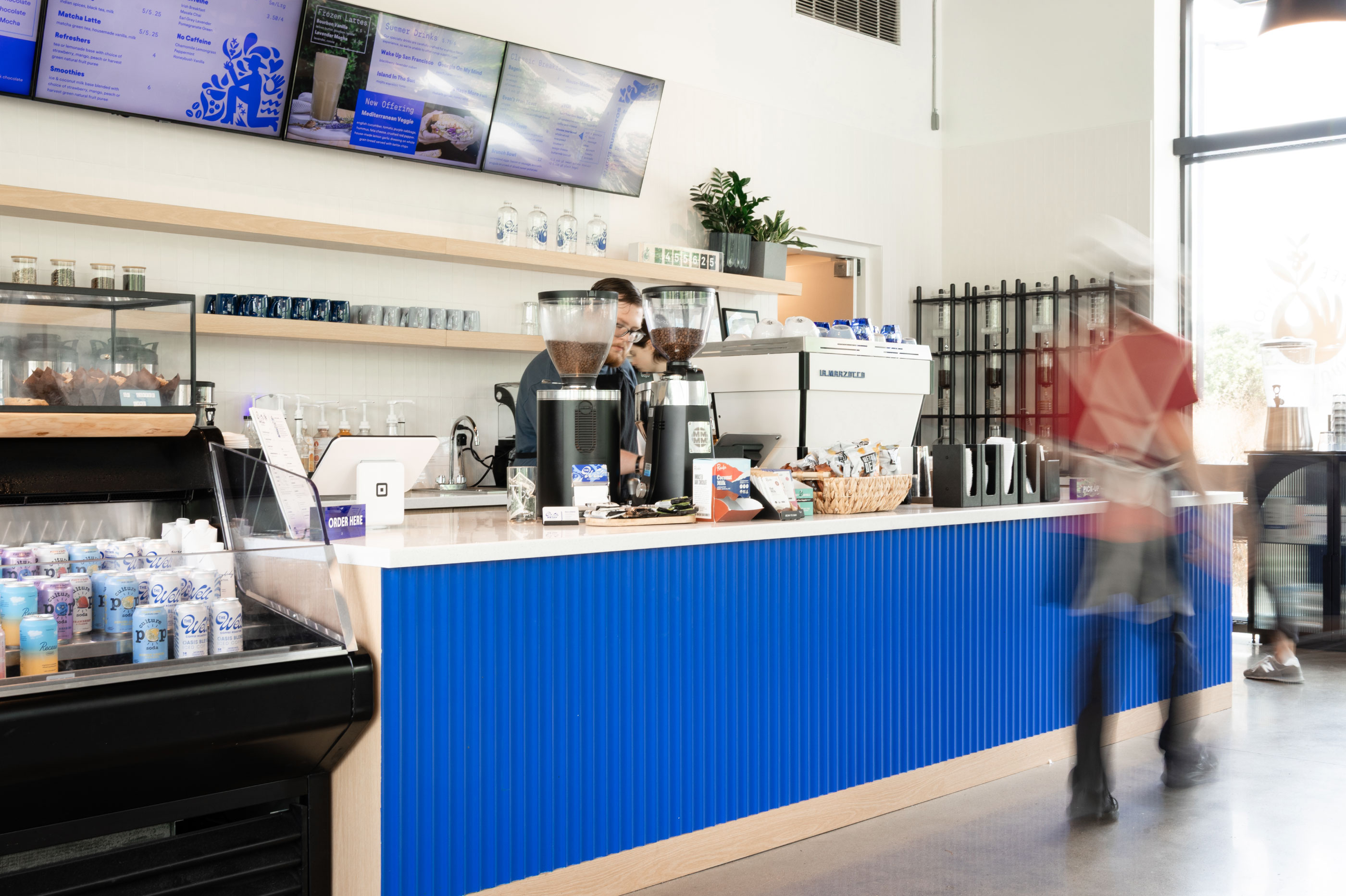
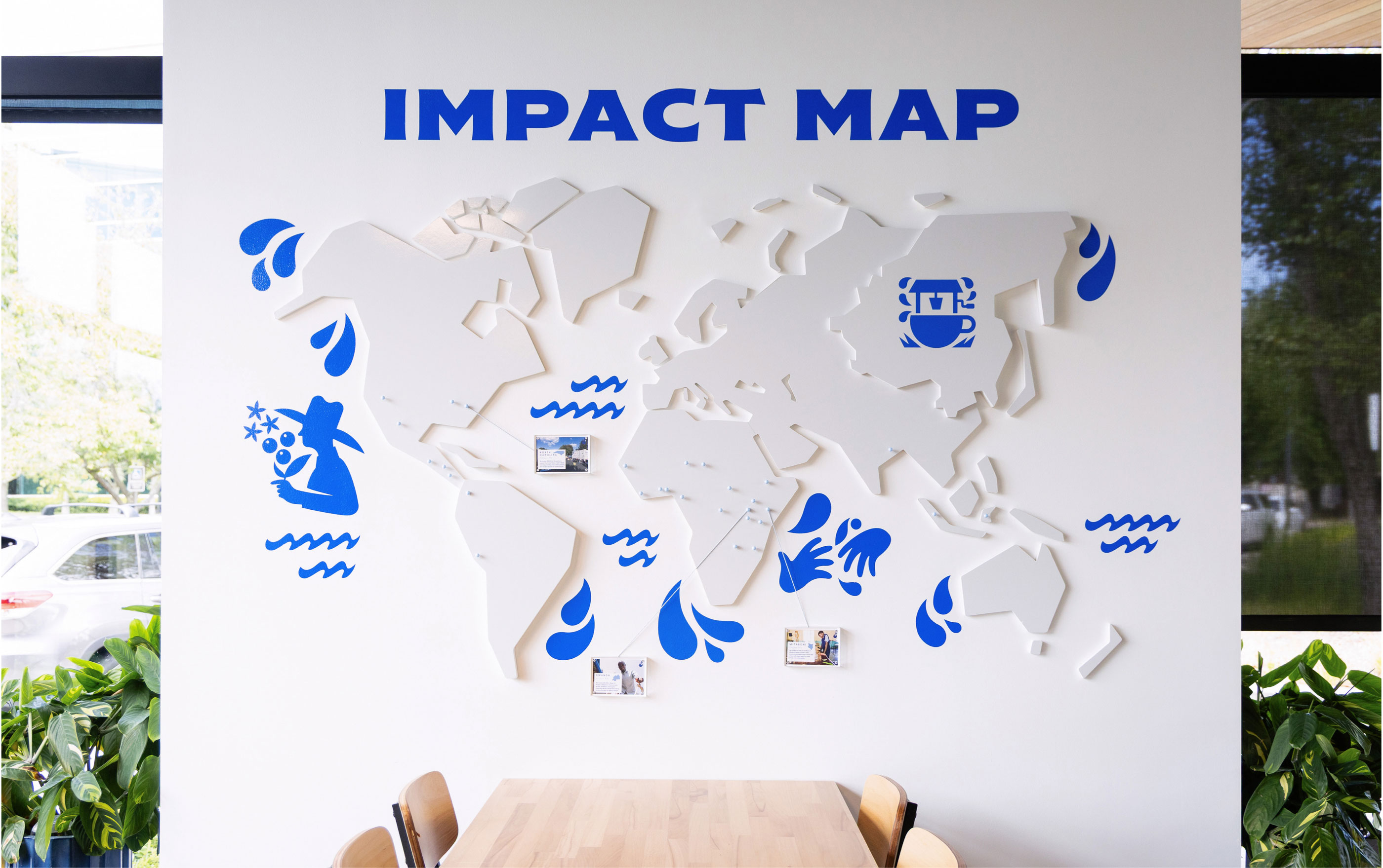
In addition to the core identity, we extended The Well Coffeehouse brand into its retail environments, transforming their retail space into an extension of the brand story. From a refreshed exterior signage package and intuitive wayfinding system to a custom bar design and an interactive Impact Map, every touchpoint was designed to immerse guests in The Well’s mission. These elements do more than guide or decorate; they create moments of connection, celebrate the brand’s purpose, and turn the physical space into a stage where community, craft, and impact come together. By embedding the identity into the environment itself, we ensured that the brand is not only seen, but deeply felt.