New Glory Craft Brewery
REBRAND & PACKAGING
New Glory Craft Brewery—located in Sacramento, California—came to us in need of a brand refresh after nearly ten years in business. Carpenter Collective was challenged to create an identity and packaging system for the craft brewery that would help the brand stand out in a very competitive marketplace. New Glory wanted their brand to align with their passion for high quality product of course, but more so it needed to reflect the breweries eccentric, and often times wacky and experimental attitude.
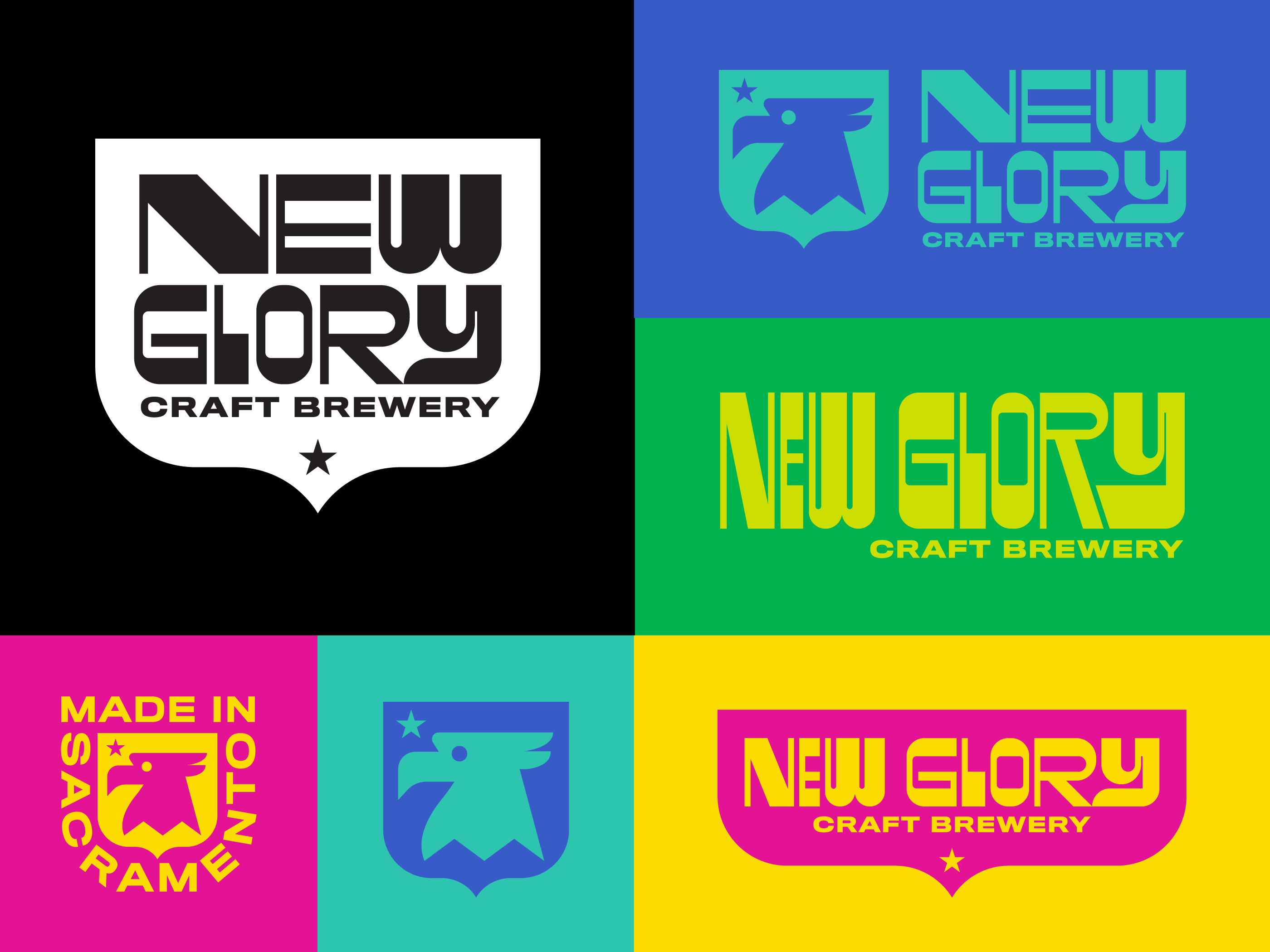
New Glory did not previously have a symbol within their brand identity. We felt a key way to allow the brand identity to work on the diverse array of applications, was to introduce a strong symbol. One of New Glory’s owners, Julien Lux was originally from France. The inspiration behind the brand name New Glory came from the owners feeling towards the United States. The US always represented opportunity, freedom and endless possibilities. This is how our New Glory eagle symbol was born.
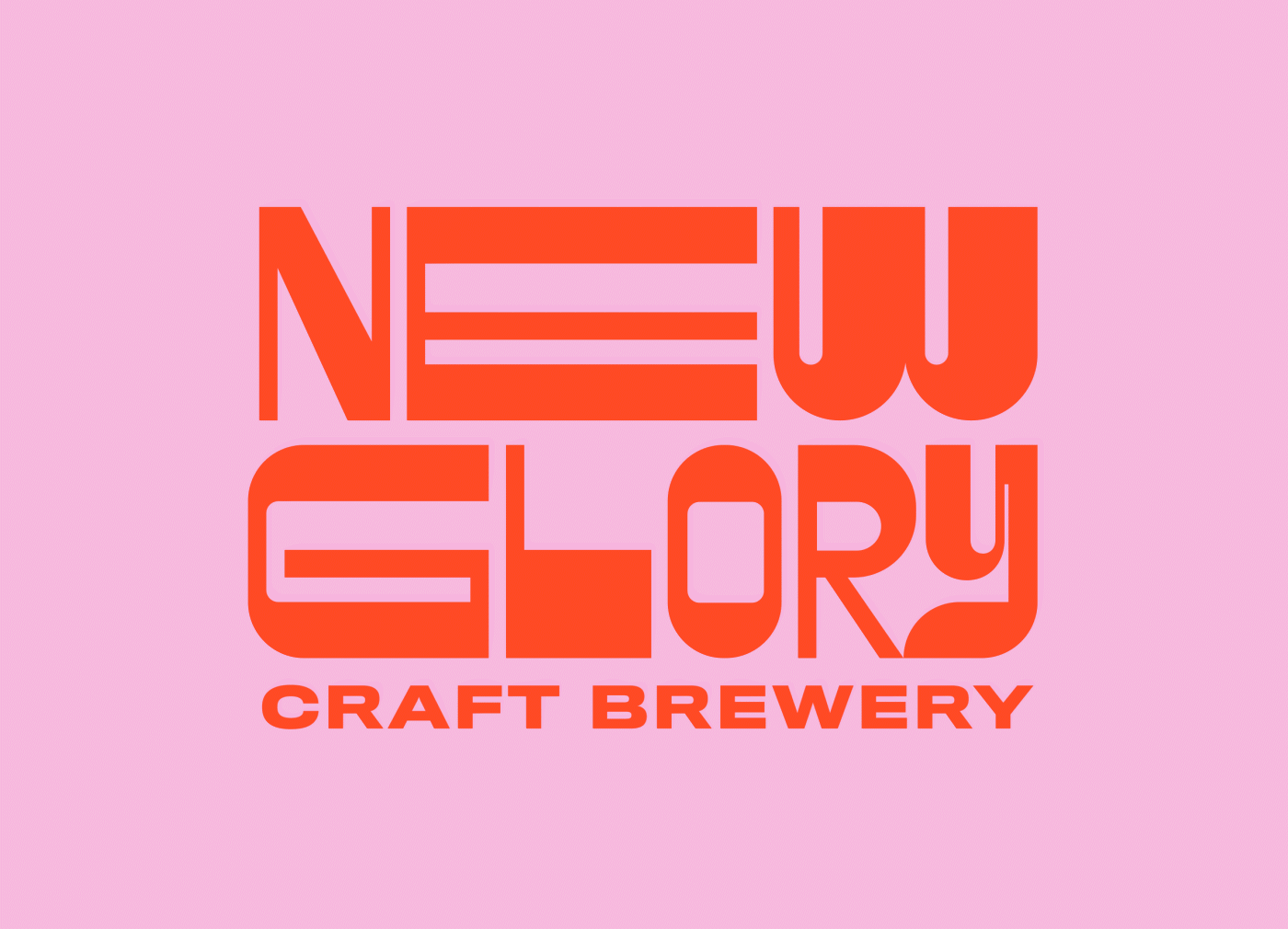
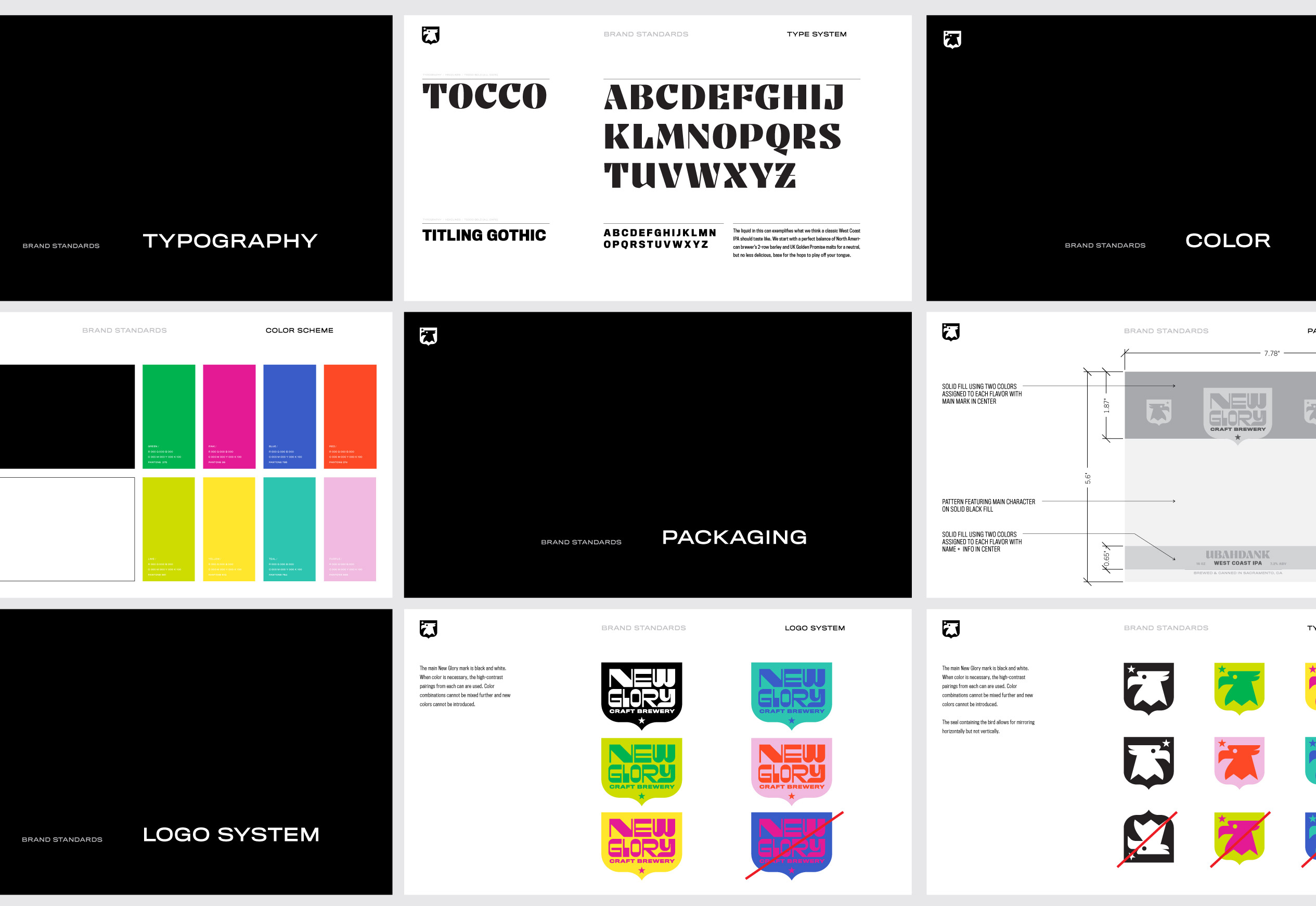
The word mark needed to be functional, modern and playful. The word mark primarily lives in a shield like badge, inspired by a French coat of arms which is a nod to owner Julien Lux’s French roots. We created a typographic system that was expandable for the brewery’s changing demands. Within their brand standards, we offer several word mark widths and heights to fit their diverse needs.
“Their work is already proving to have an impacting impression on our consumers. Carpenter Collective have been a pleasure to work with.”
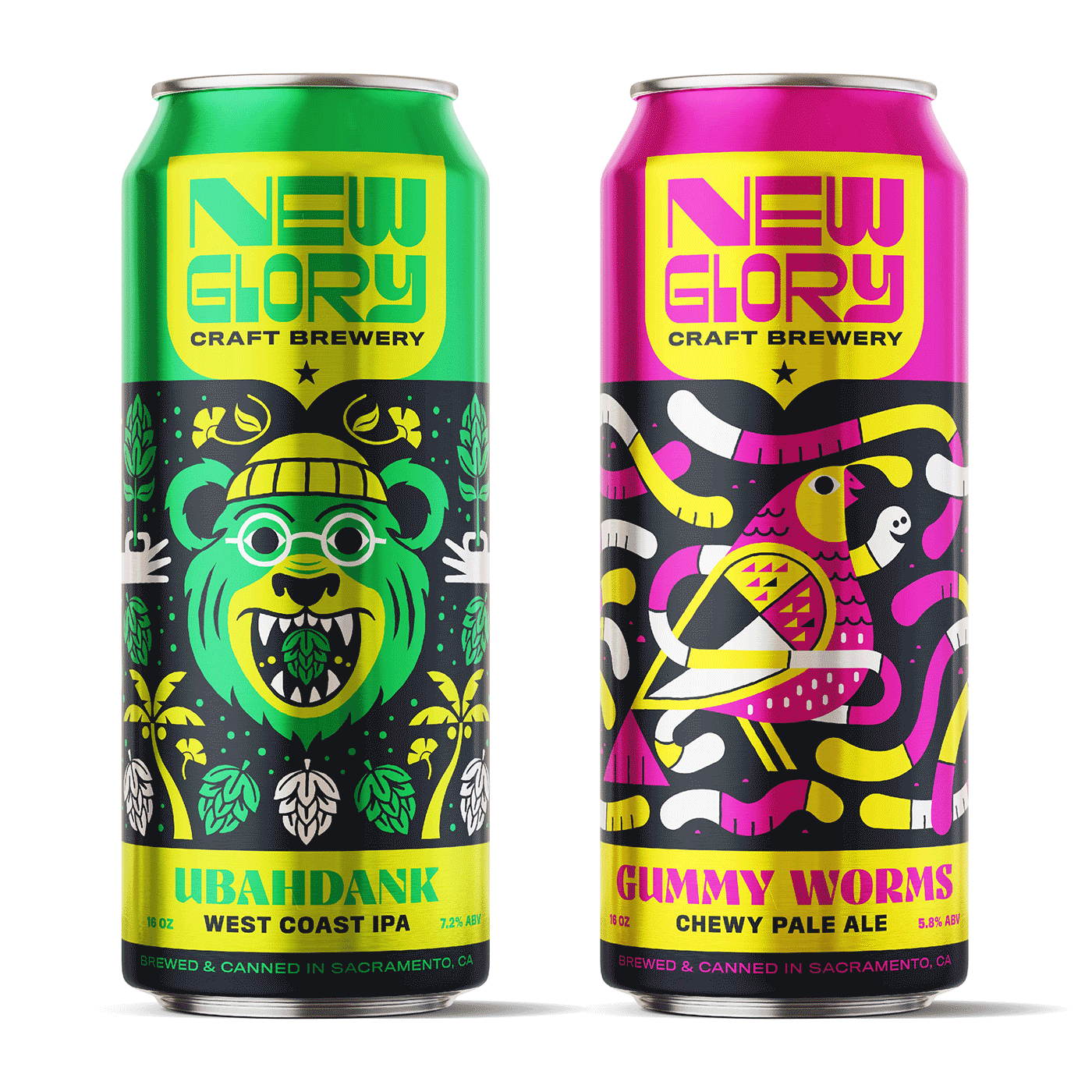
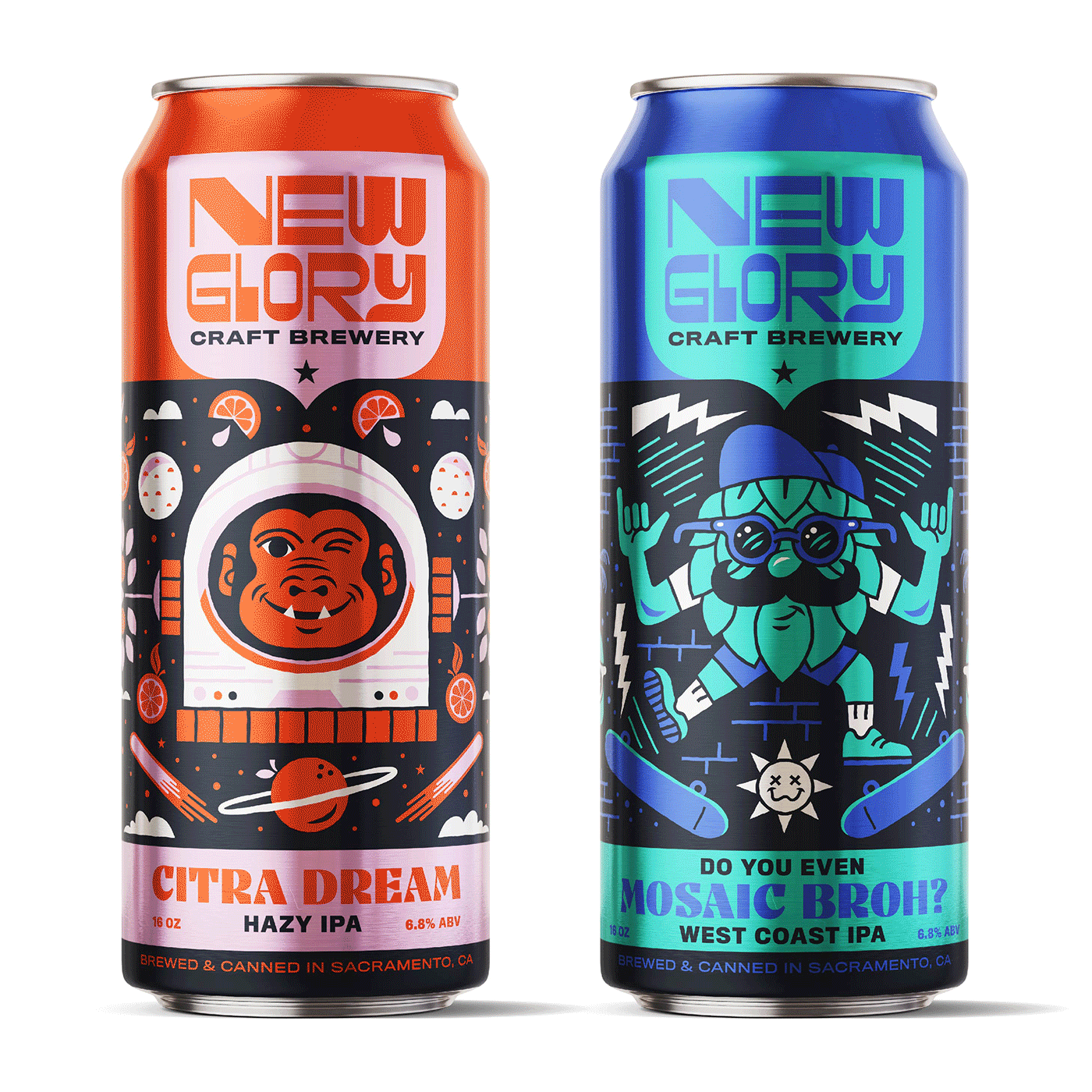
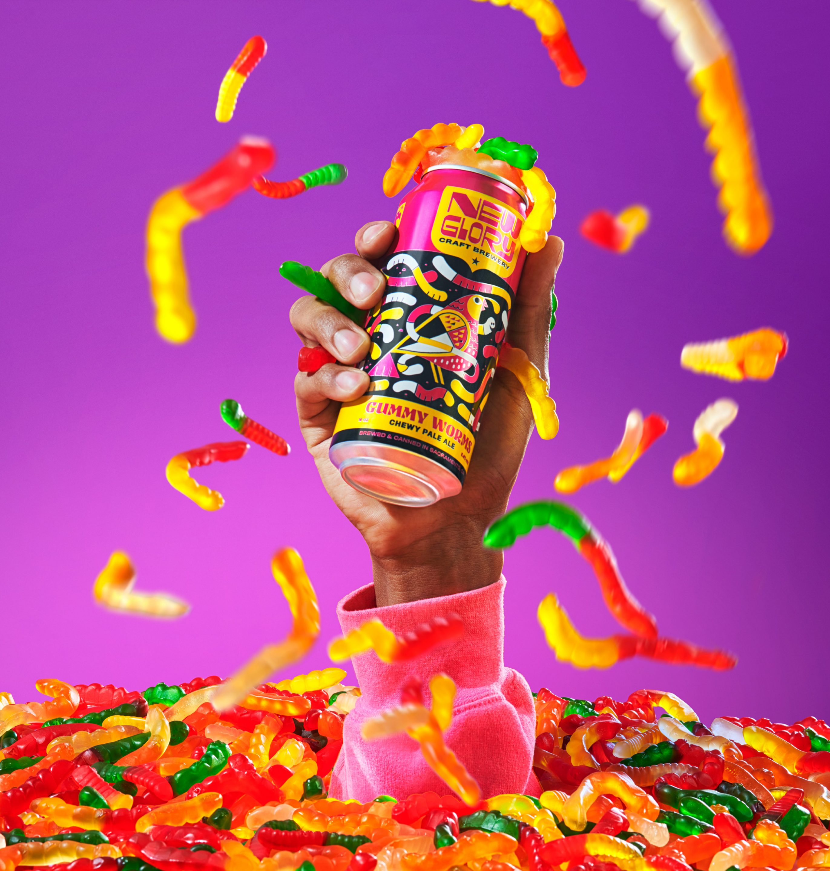
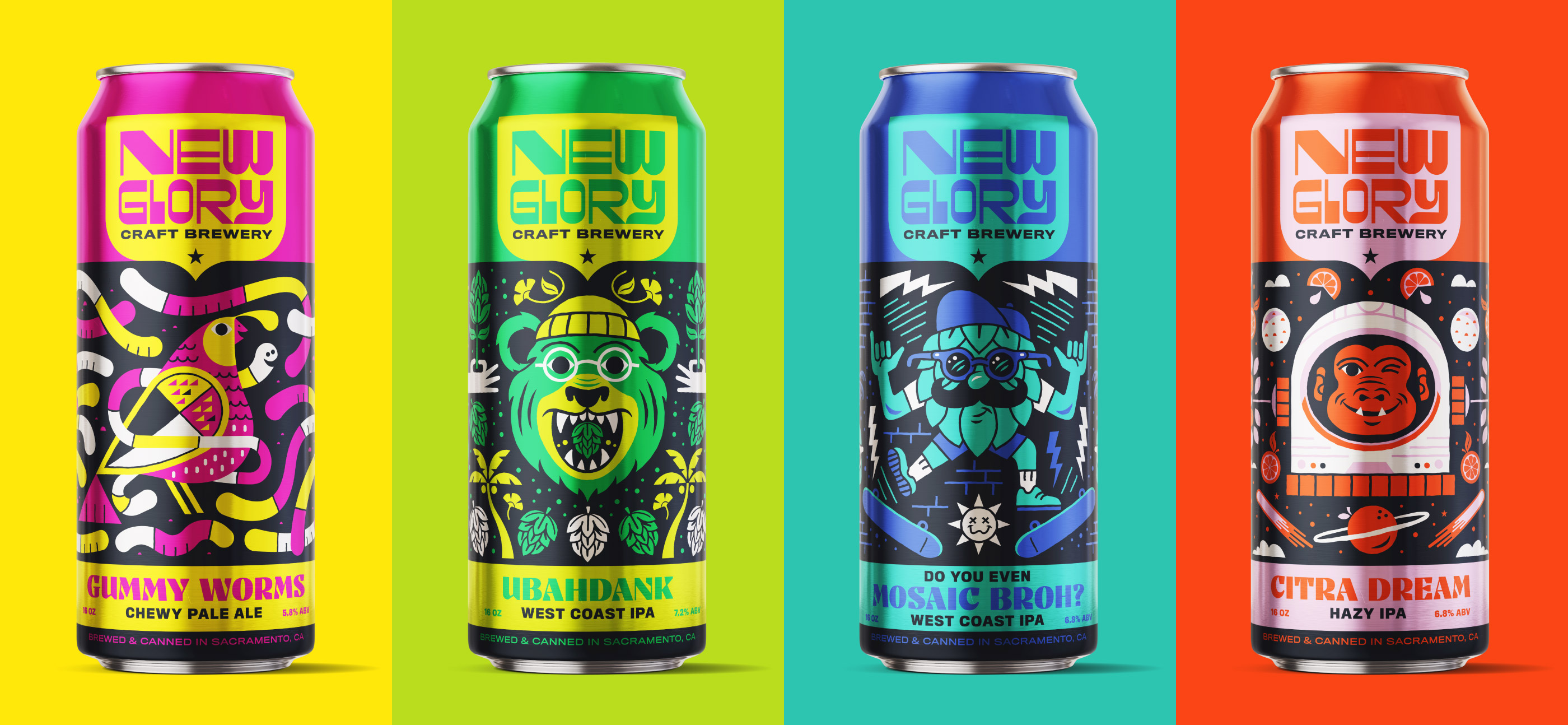
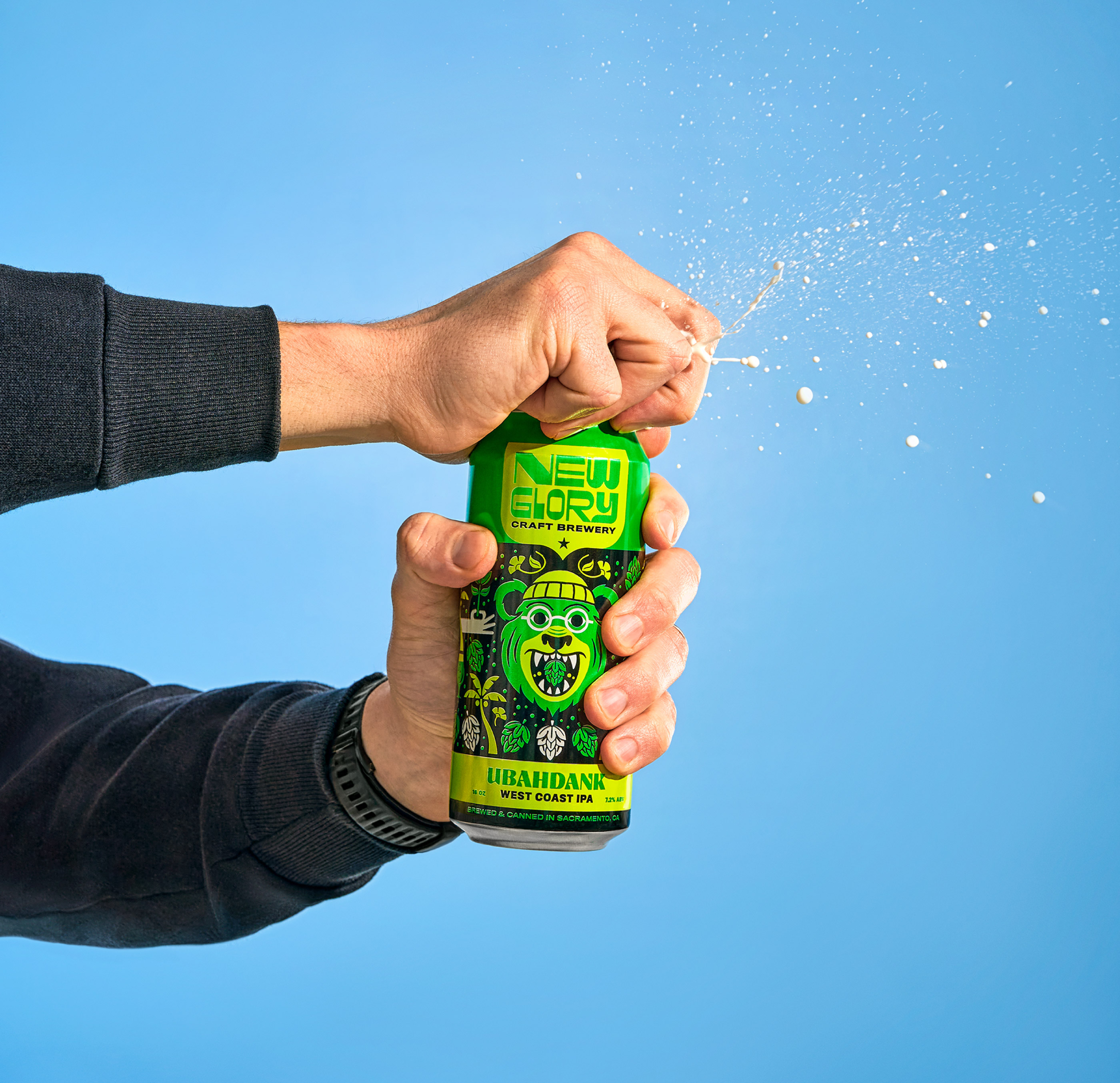
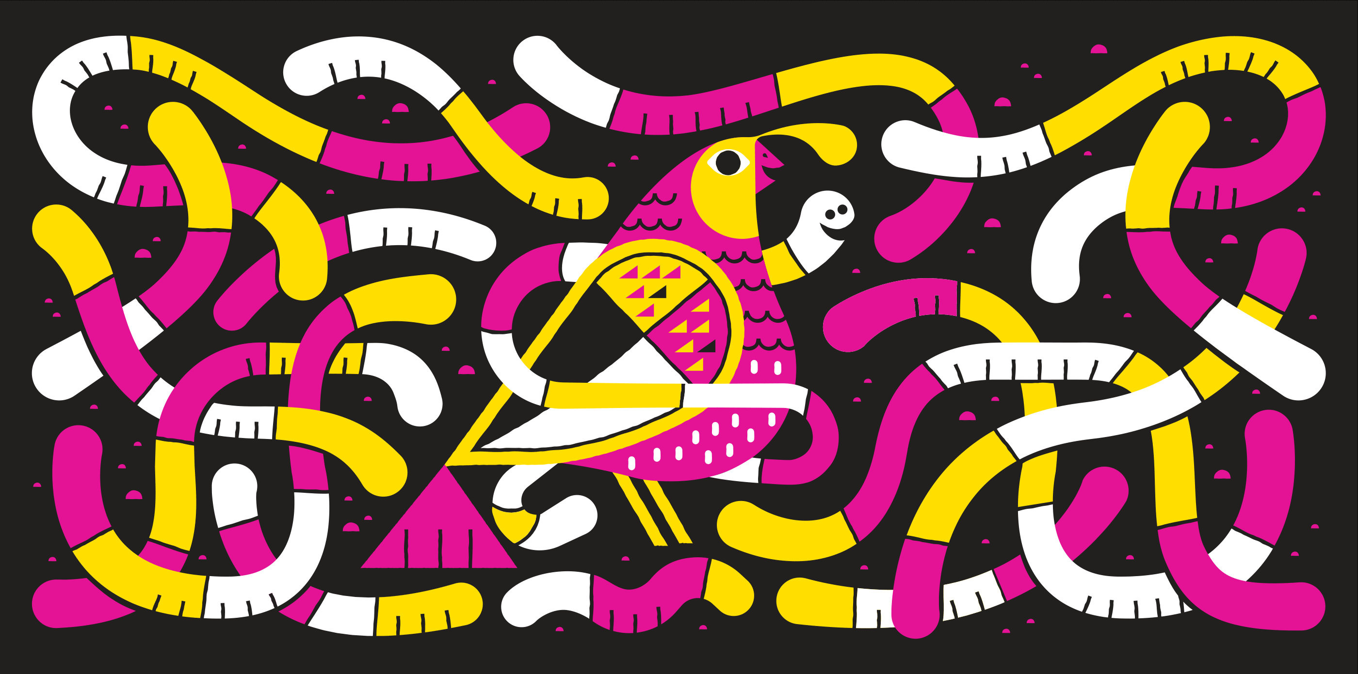
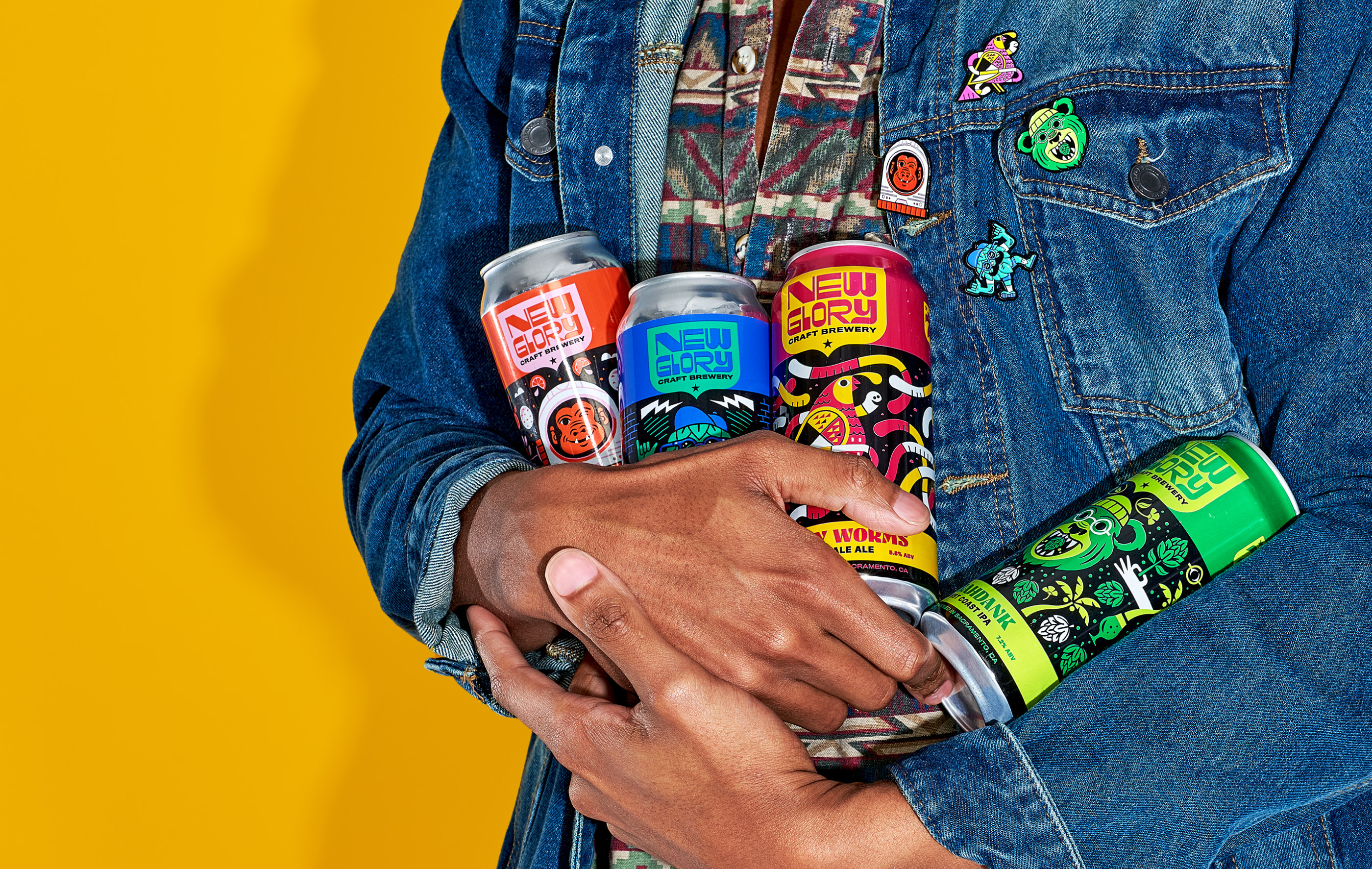
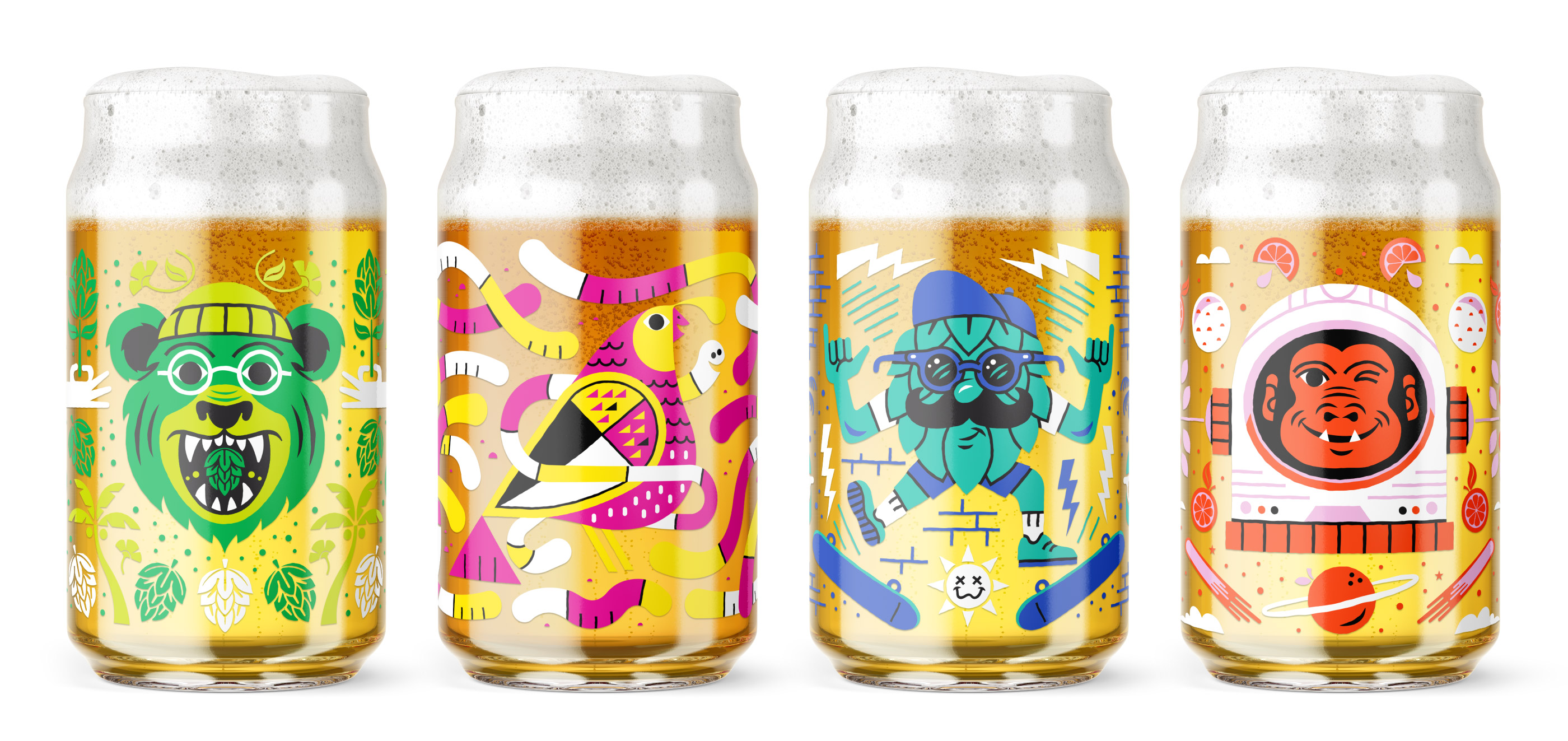
In addition to developing the brand identity and standards for New Glory we were also tasked with building a cohesive packaging system for the brewery. We started by developing the four year-round staple beers. These core-cans needed to work holistically together yet have enough visual interest to stand alone. Each can has a central visual hero with a connection to California, the breweries home state. Ubahdank features a California grizzly bear, Gummy Worms dons a California quail the state bird and Citra Dream showcases a space chimp which is a nod to the Aerospace Museum of California located in the Sacramento area. To create unity within the packaging system, we intentionally created a bold color band on the upper third of the can packaging which also houses the logo. The can packaging artwork and color palette changes on each beer, but this large color band stays consistent on all core beer cans.
“The Carpenter Team calmed our pre-brand nerves by taking the time to get to know our business and to help define our goals. Their small and professional team understands the value in a design “system,” rather than just a logo.”


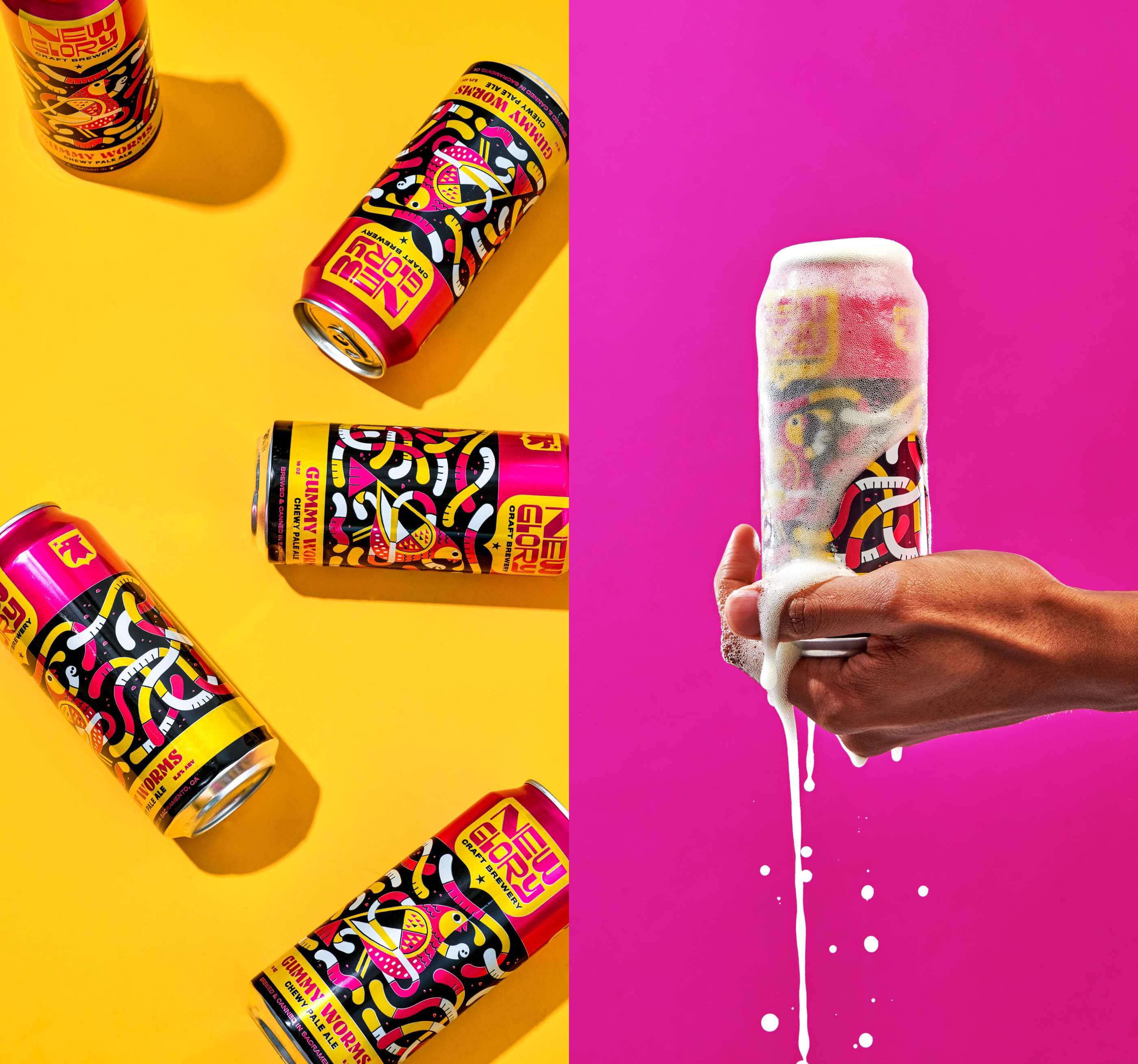
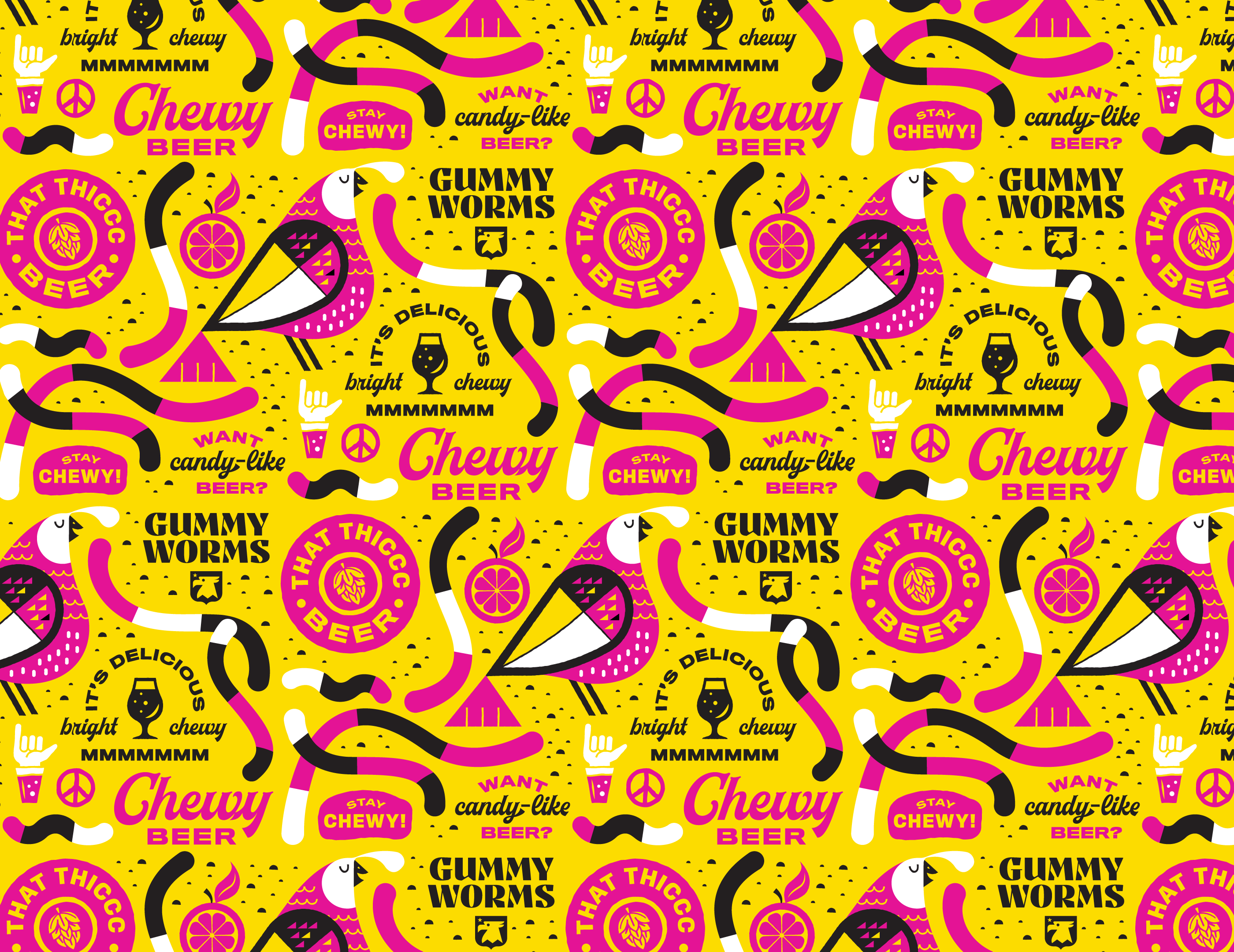
The previous New Glory packaging system was completely pattern based. We wanted to honored the equity established by allowing each of our new can packaging pieces to also feature patterns. The illustrative and typographic patterns within the system educates the consumer on the company’s offerings while reinforcing the eccentric yet approachable culture New Glory has cultivated. The patterning becomes a medium where the brewery can speak directly to their consumer and share what makes them and their product so unique. We supplied New Glory with patterns for each of their four core-beers as well as many general brand patterns for the brewery to use through a wide variety of applications. In the end, we wanted to supply a wide variety of brand elements, illustrations, icons, badges and typographic lock-ups that could help them stand out and evolve with their experimental approach to brewing.