The Brass Onion
Brand Identity Experience
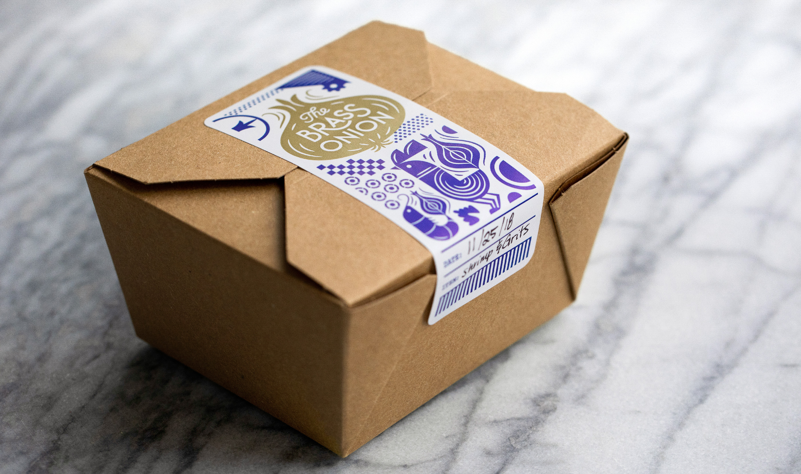
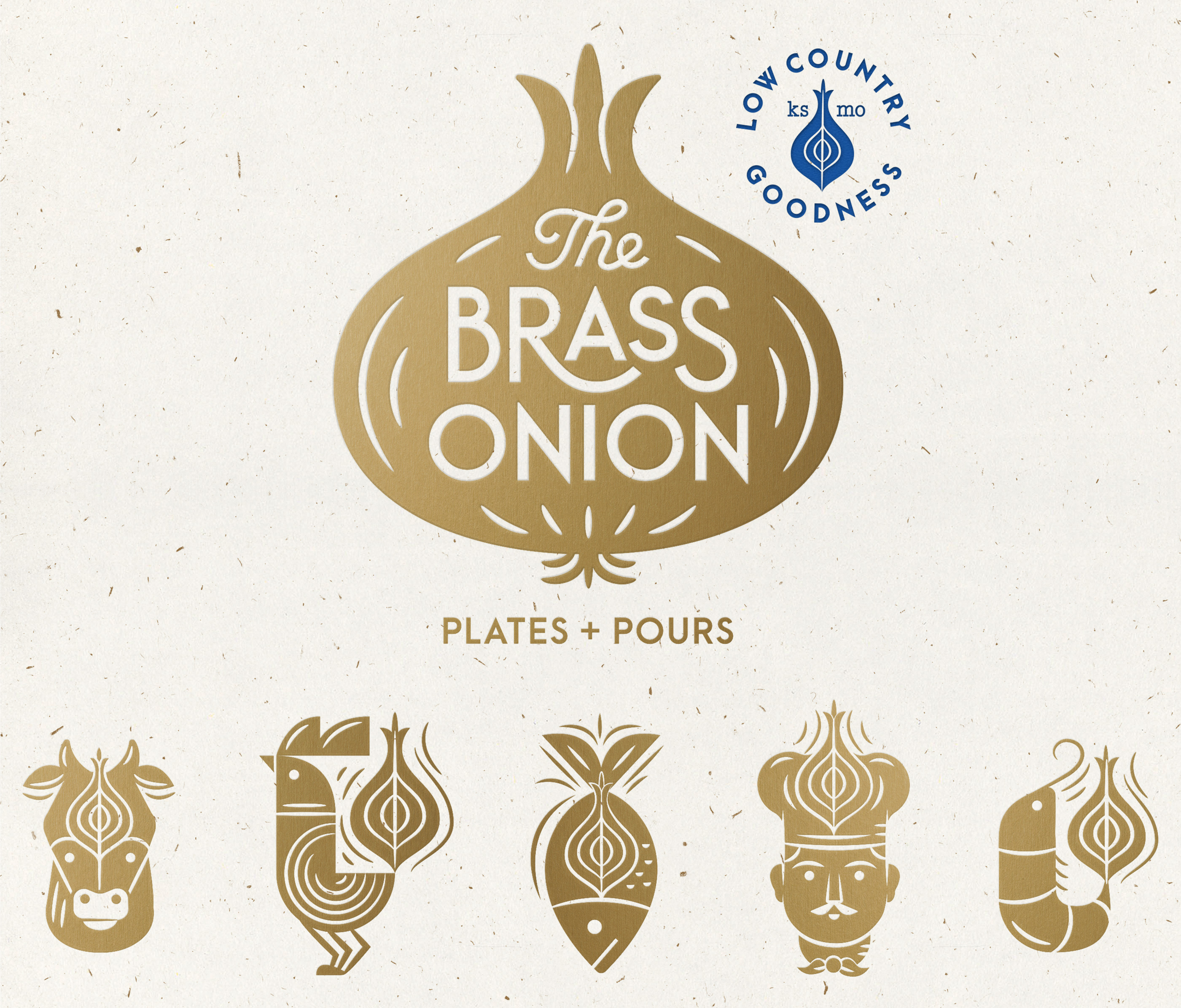
The Brass Onion is a modern American restaurant with low country flare and traditional family favorites. Located in Overland Park, Kansas this eatery has become an everyday favorite for locals. The goal was for the branding to feel somewhat elevated yet approachable and light-hearted—paralleling the menus diverse, refined comfort food offerings. The brand components consisted of a logo system, brand identity system, four different menu designs, coasters, to-go packaging, interior and exterior signage.


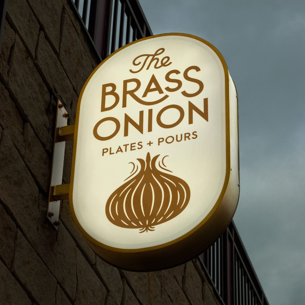


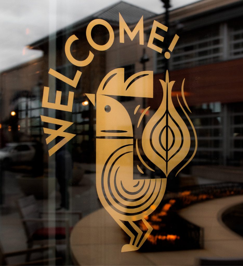

Front door Welcome Sign | Restroom wayfinding


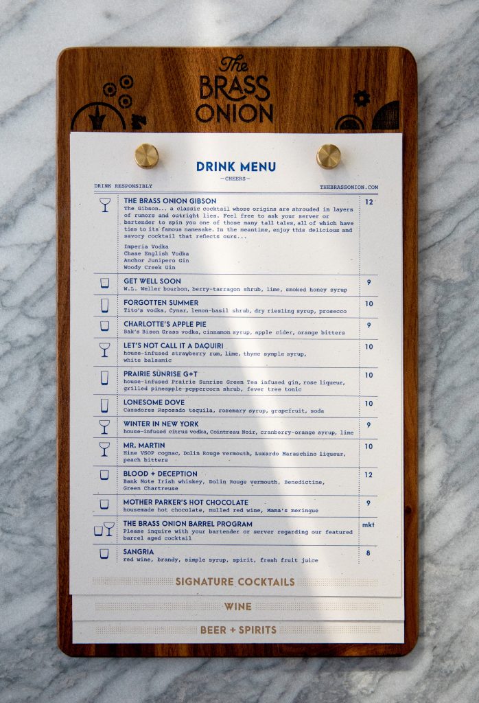
“Throughout the identity, elegant characters were made more playful with a Brass Onion twist.”
The Brass Onion is refined comfort food. We knew we needed a similar harmony created with the identity. We played with a balance of sophistication and whimsy to set the tone for the branding. Each icon incorporates the onion in a simple and clever way—just as many of the menu items do.
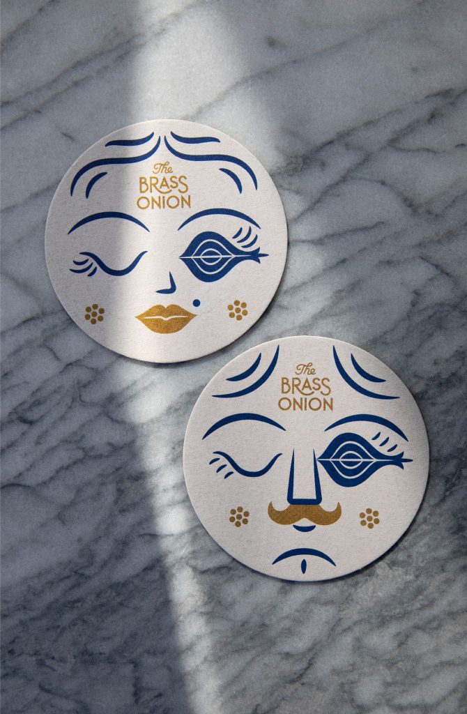
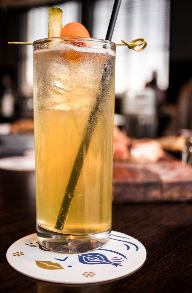


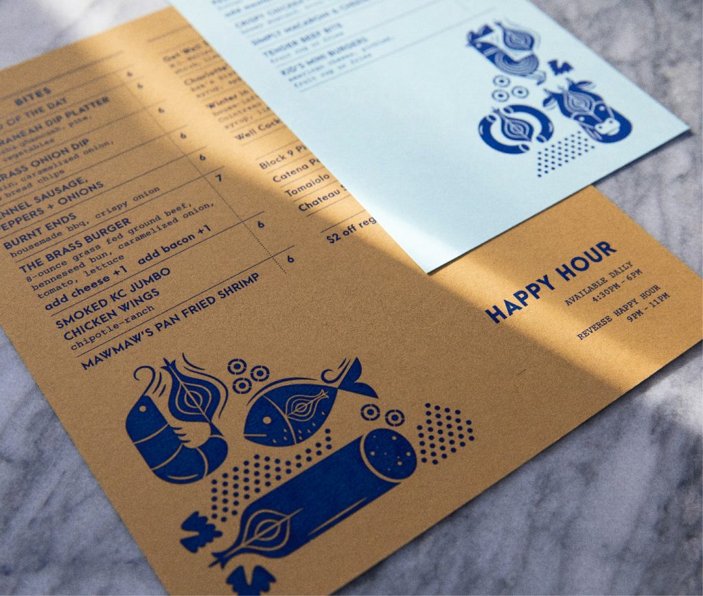

The brand patterning shown on the back of the menus, business cards, tissue paper, packaging labels and various other touch points was inspired by the restaurants ornate and playful mosaic floor tile that can be seen through the dining area of the restaurant.
