Spin! Pizza
Experience Design
Spin! Pizza got its start opening its first restaurant in 2004. With great passion, SPIN! has been committed to serving high quality food alongside great wines and craft beer in a fast casual environment. With a culture of guest first service, Spin! came to us to streamline the ordering process. We started with a strategy session to evaluate the current ordering system and understand customer feedback. We then worked through design solutions that enhanced and simplify the experience and launched the updates at their Main Street location in Kansas City.
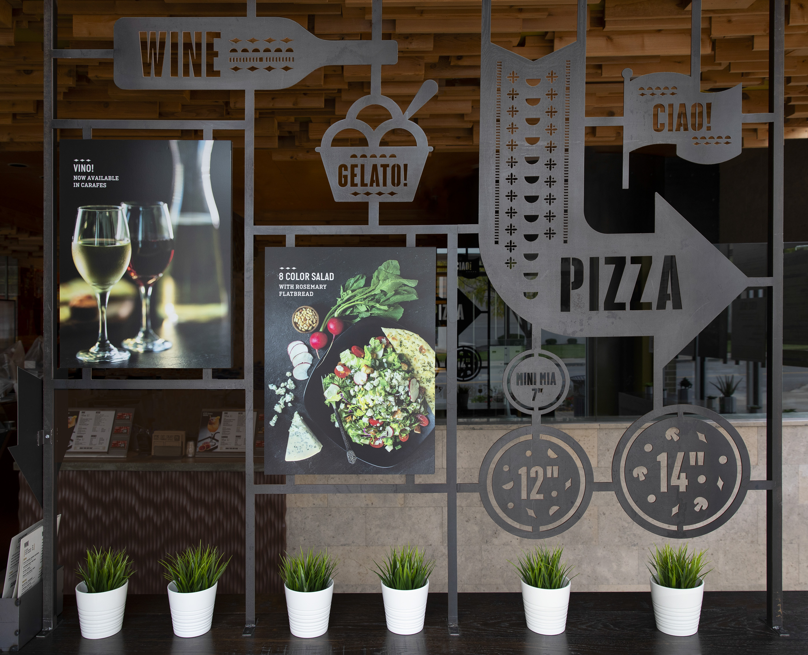
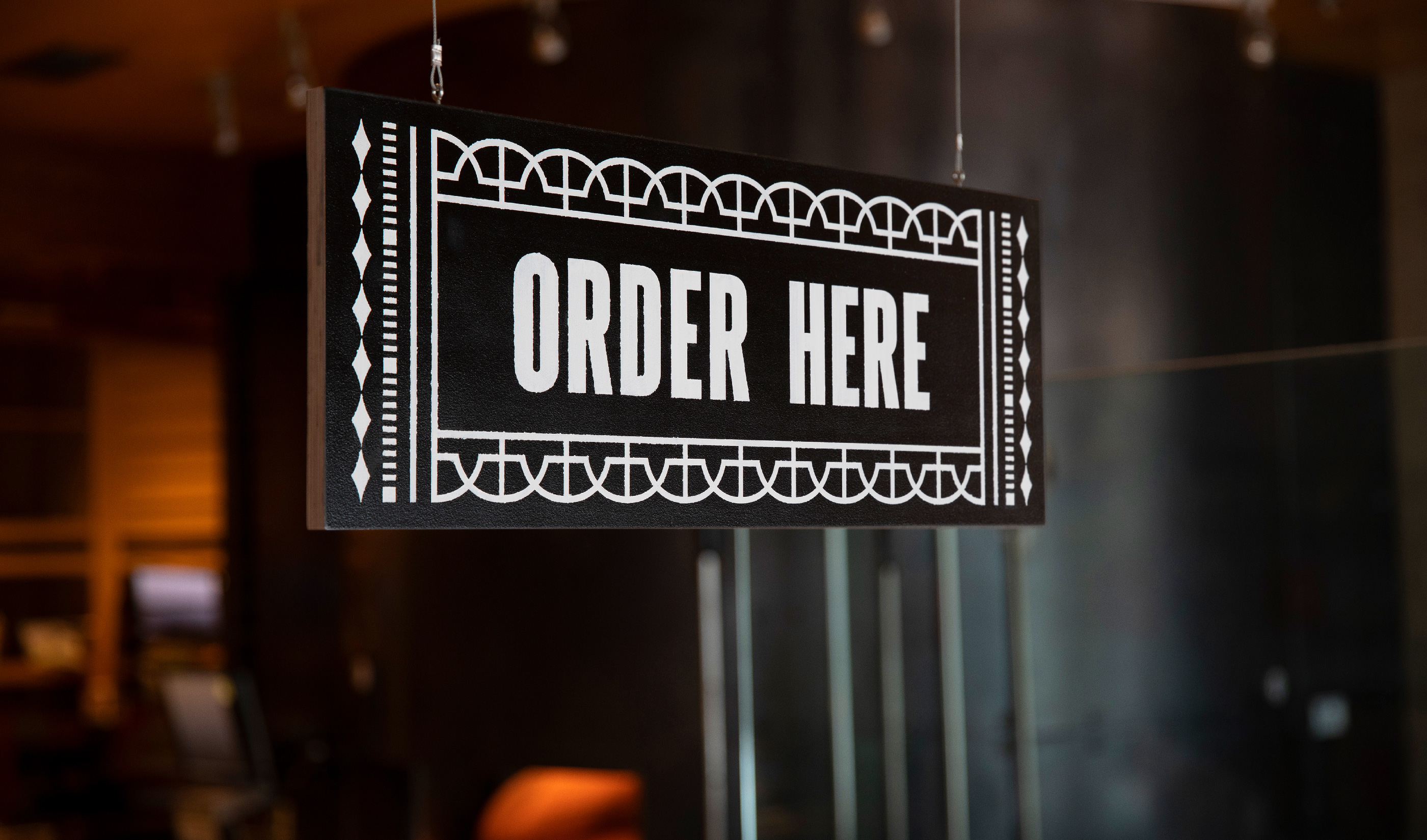
You are greeted upon entry with a central display. The goal of this area was to not only be visually impactful but also extremely functional. The center display guides customers through the ordering line. The metalwork created out of hot-rolled steel features references for guest to visualize the three different pizza sizes. Magnetic photo displays allows for Spin! to update promotional images throughout the season.
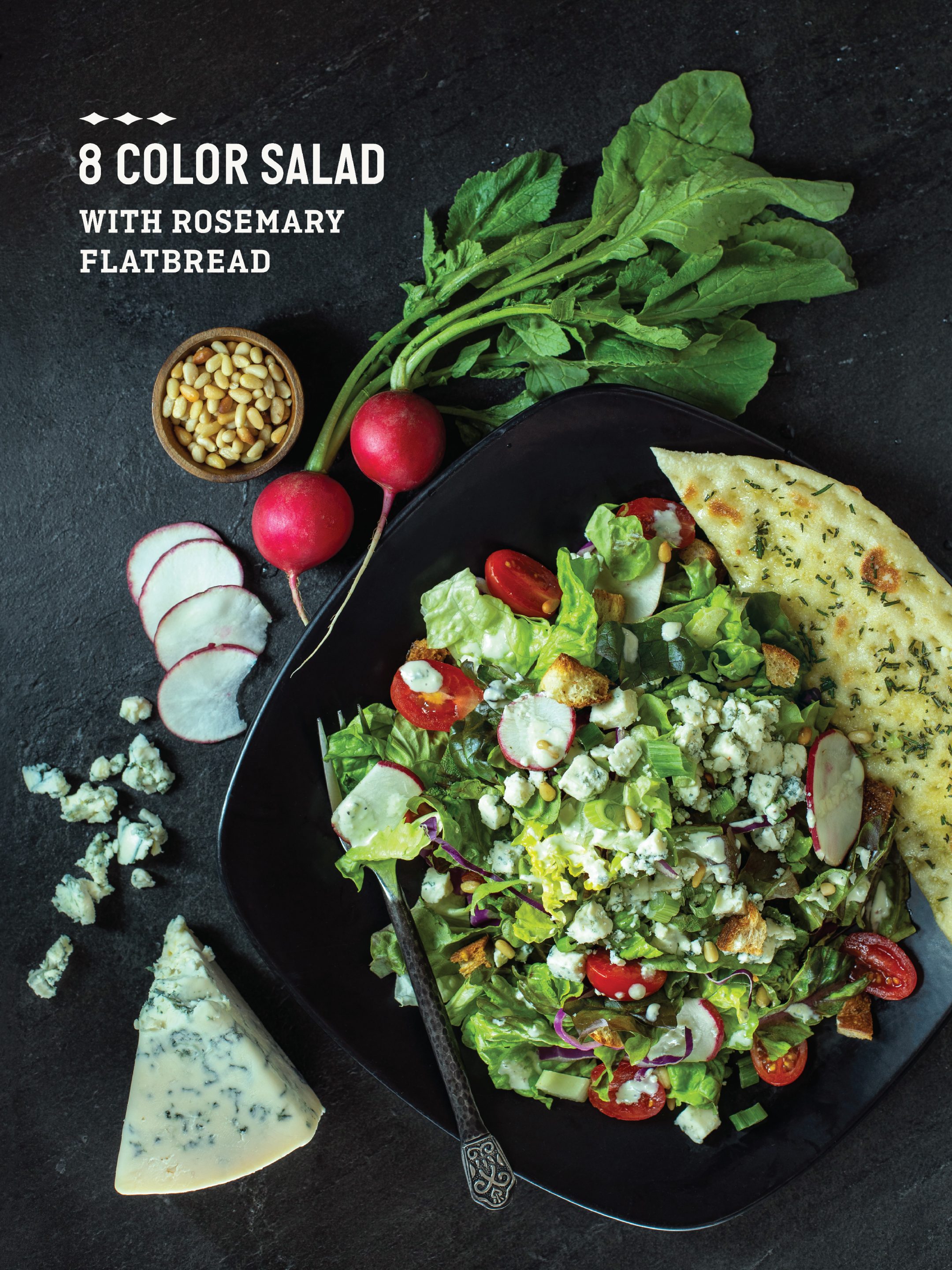


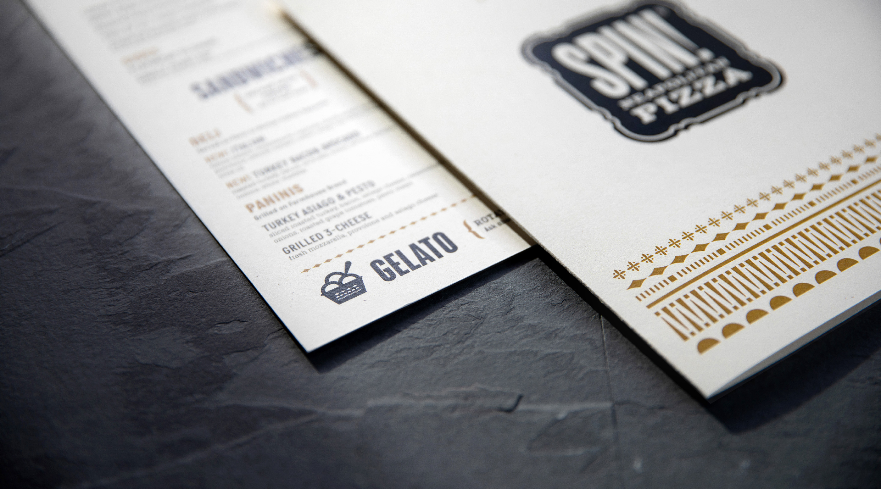
Past the center display you are greeted with the new menu board system. We worked with the Spin! team to streamline the menu by reducing the number of items and simplify the naming and pricing structure. With the updated menu paired back, our goal was to create a flexible system. Individual boards house different categories that can now be easily swapped out with menu updates—while the visual separation between categories allows for a more digestible menu. It was important to integrate photography as well to promote new menu offerings and showcase Spin! favorites that customers may have never tried before. Although Spin! is known primarily for their pizza, their salads, sandwiches and starters are created with the same culinary detail that their a James Beard award winning chef has given to the pizza offerings.

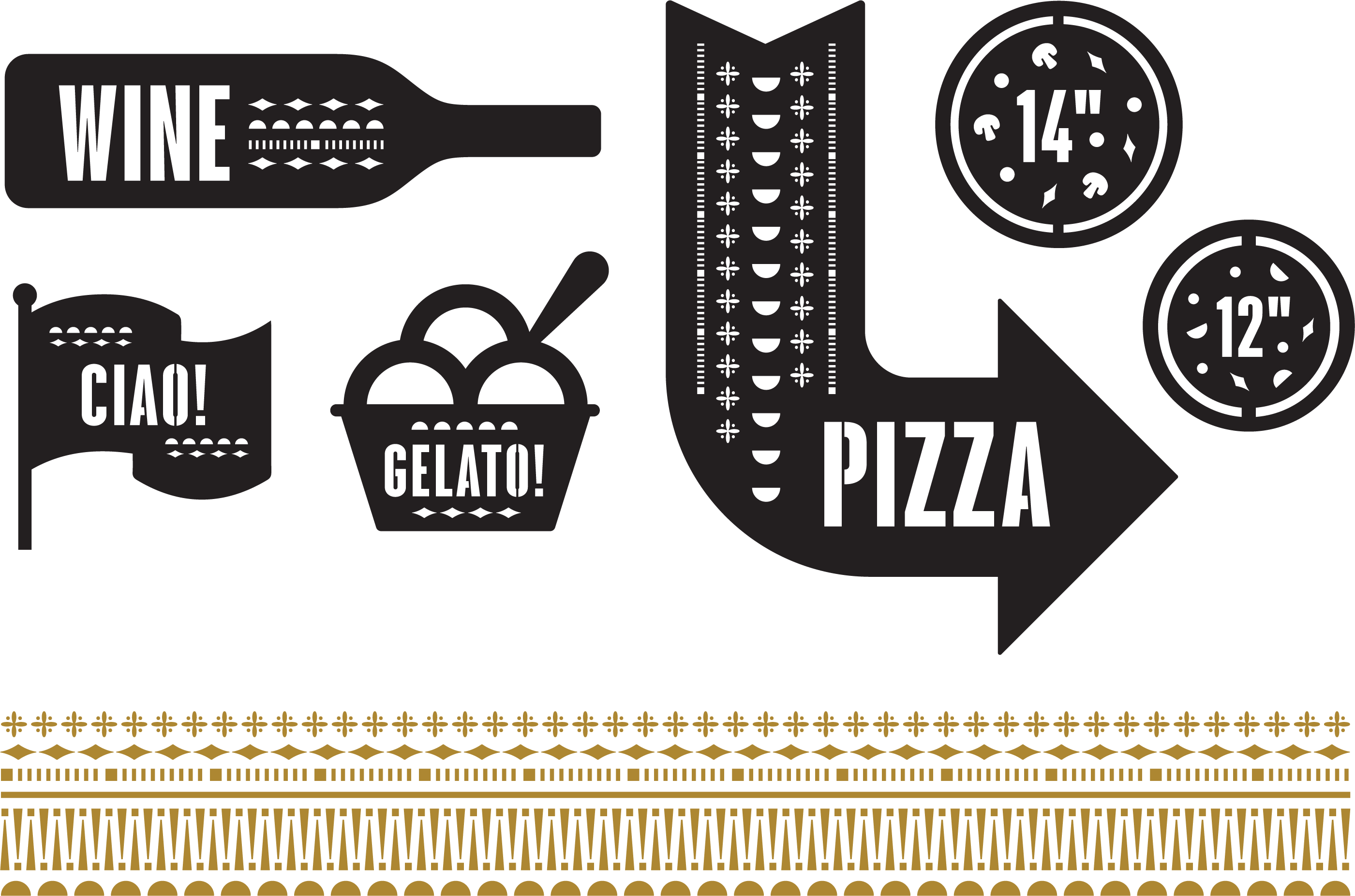
We took the identity to a more modern, simplified approach with updated design elements. Along with a paired back color palette, new fonts were selected—limiting to 2 different font families and 5 different total weights. The new border treatments and the headline font style selected are reminiscent of old Italian letterpress typefaces that complement the current murals within the dining area.


Integrating photography within the space was vital to showcase their impressive menu offerings. We worked with photographer, David Eulitt to create a library of images for the new experience. Carpenter Collective was responsible for the overall art direction of the shoot—from mood, background and prop direction, to shot lists and on-set styling.