WholesomeCo Cannabis
BRAND IDENTITY & PACKAGING
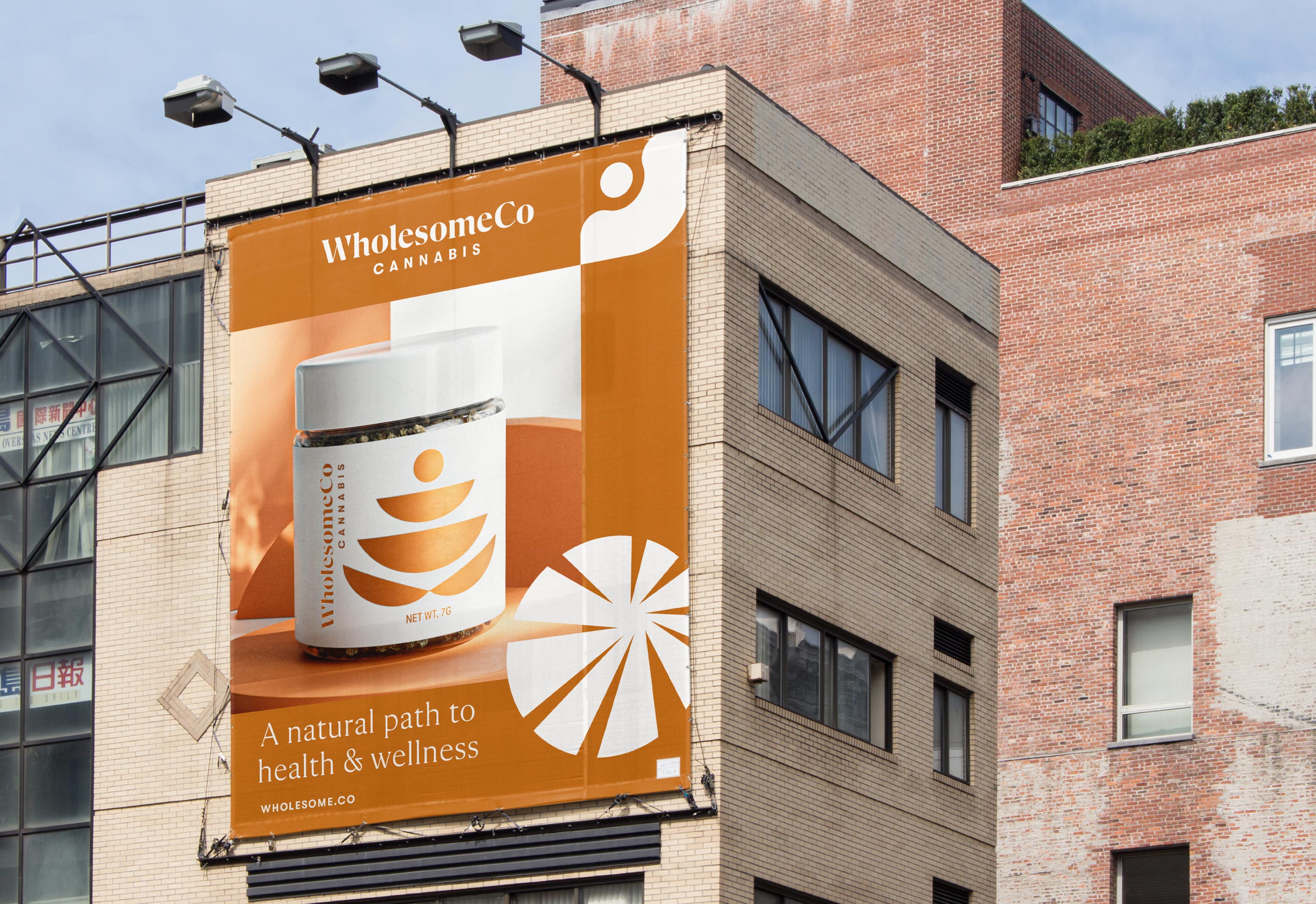
In early 2020, WholesomeCo Cannabis was a leader in bringing medical cannabis use to the state of Utah. We worked with WholesomeCo to develop an identity, packaging design system, retail experience and various digital assets for this new endeavor. WholesomeCo believes in the medicinal value of cannabis as a natural path to health and wellness. From packaging to retail design, the design intent was to present an approachable, trusted and quality brand experience at every possible touchpoint.
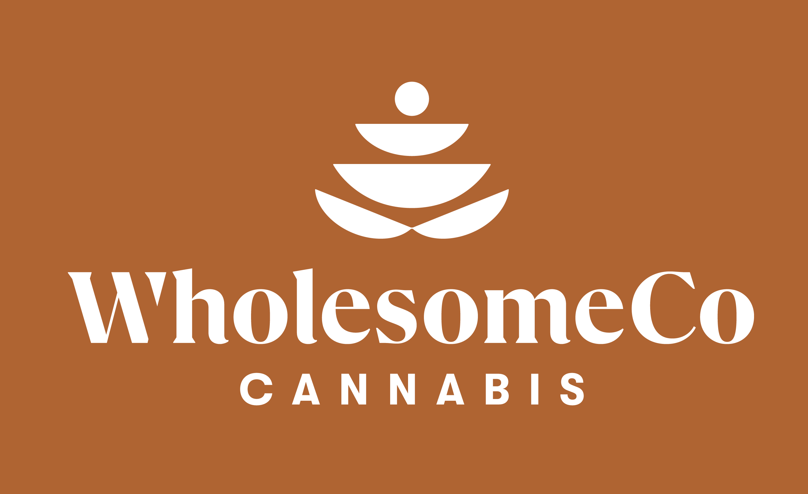

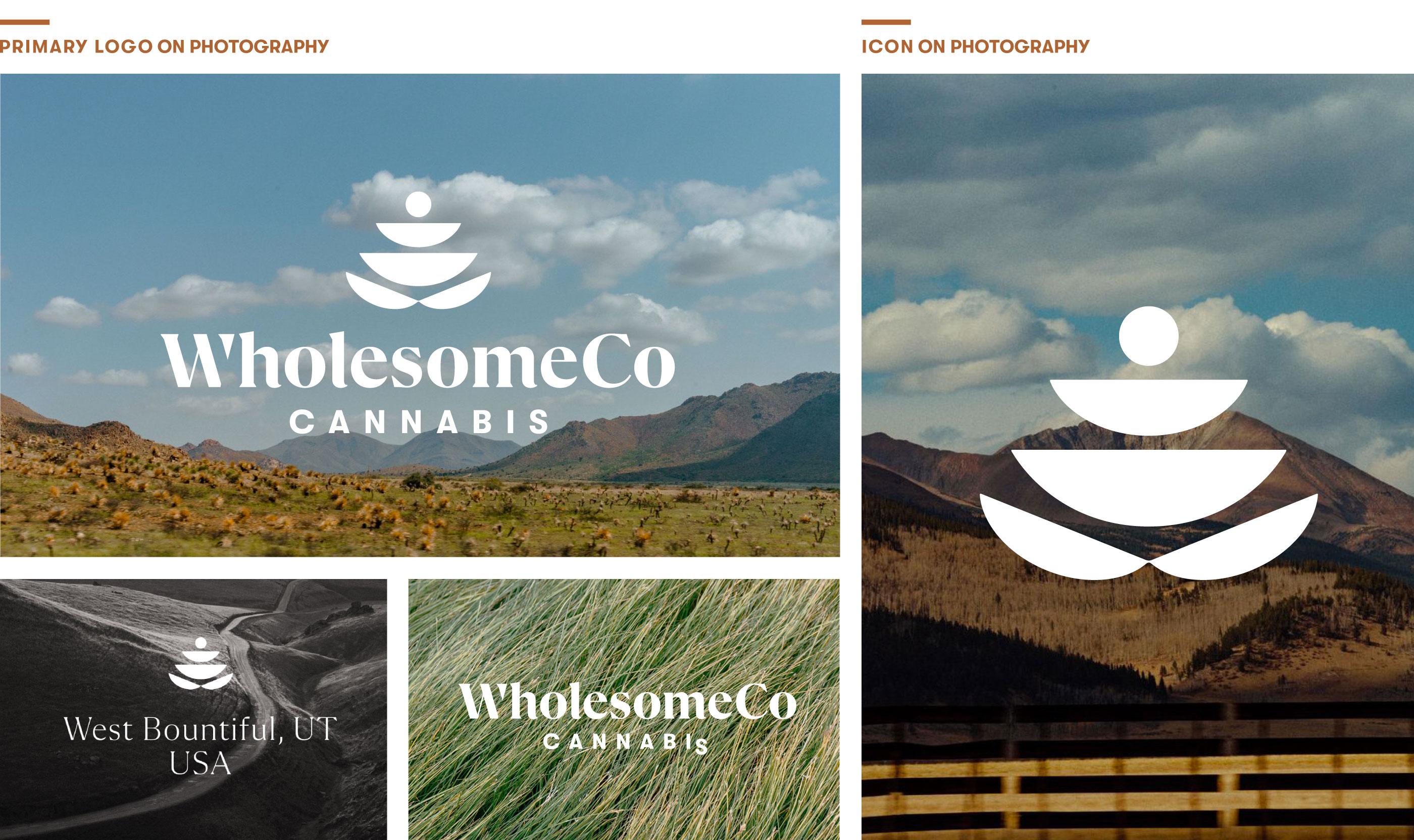
When developing the brand symbol, we wanted to make a subtle nod to the cannabis flower but do so in an approachable way. We also found inspiration in the beauty of the Utah landscapes, specifically the rock cairns/stacks a hiker might find on a trail. These found rock stacks tell hikers, yes, you are on the right path—keep going. A comforting brand message we hope also resonates with WholesomeCo consumers. Overall, this mark is inspired by nature and represents growth and balance—both attributes WholesomeCo sees their customers trying to achieve with their product.
“Carpenter Collective really helped solidify our brand direction out of the gates. Carpenter was able to develop a set of brand assets and an overall brand direction that has only strengthened in time.”
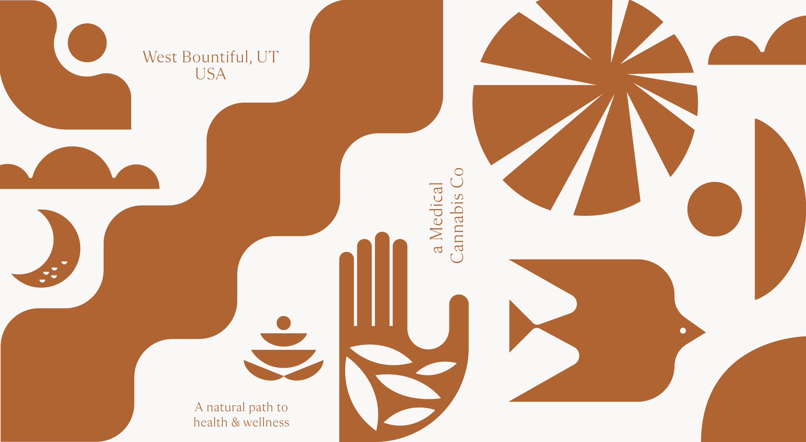

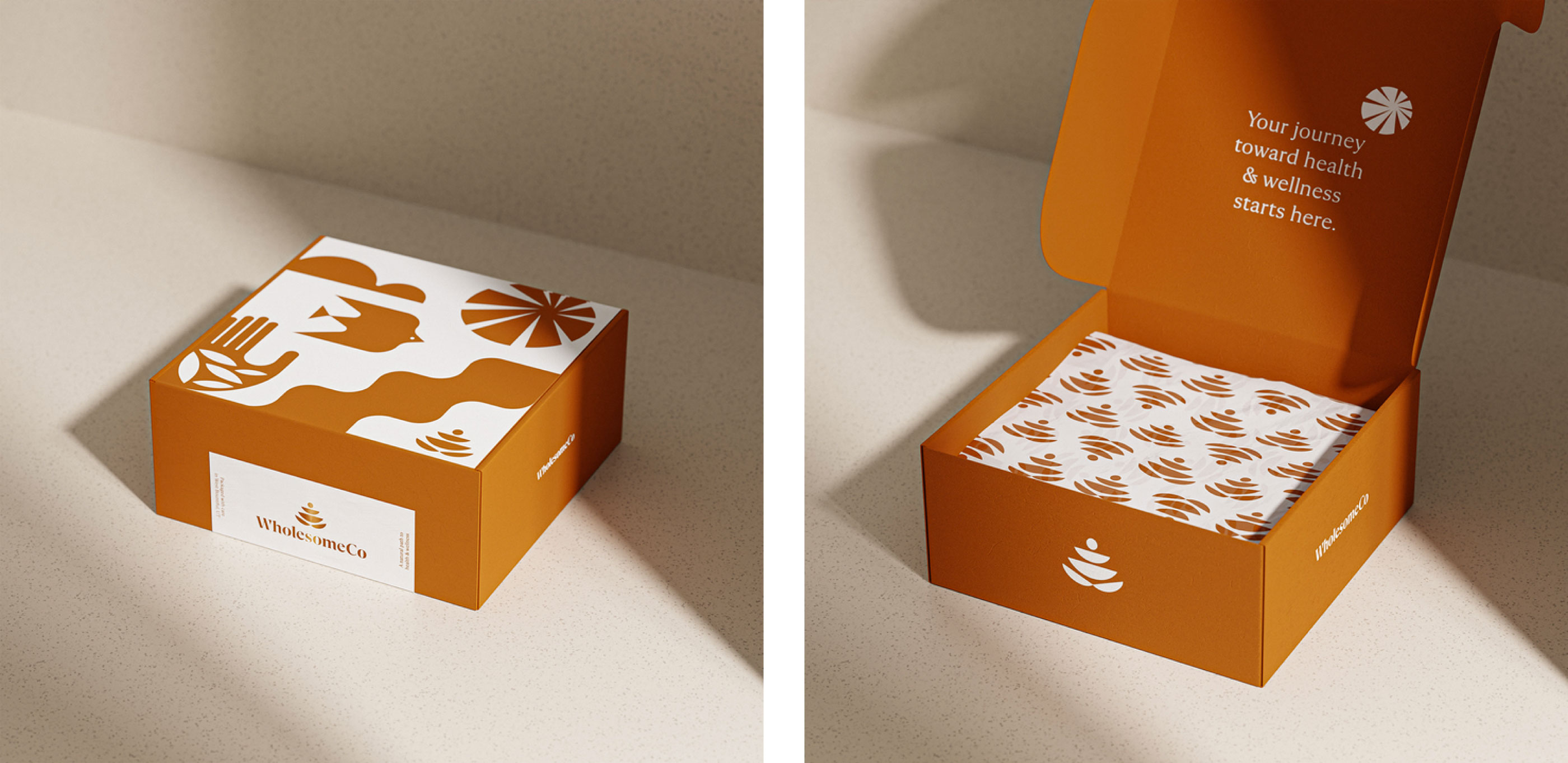
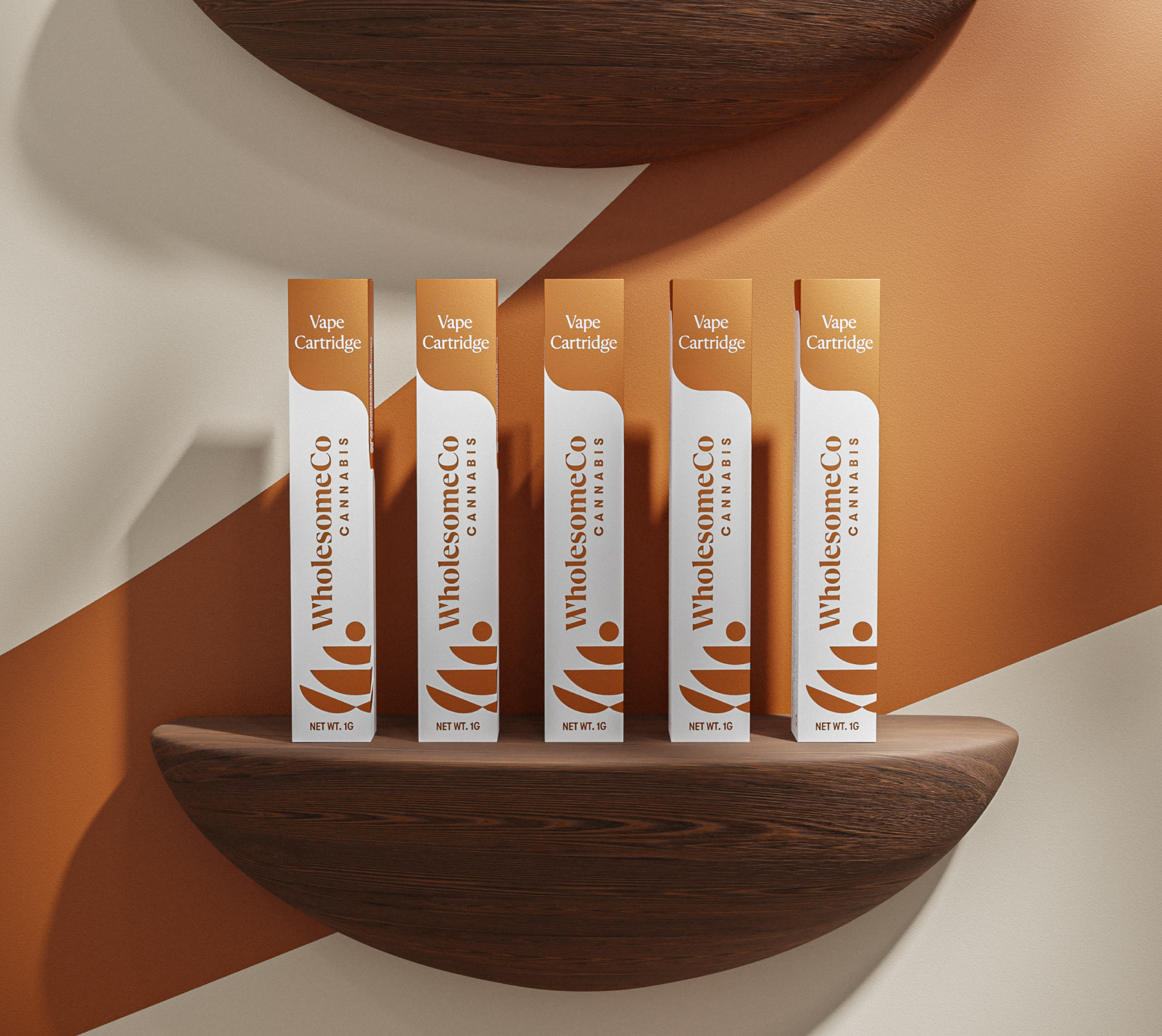
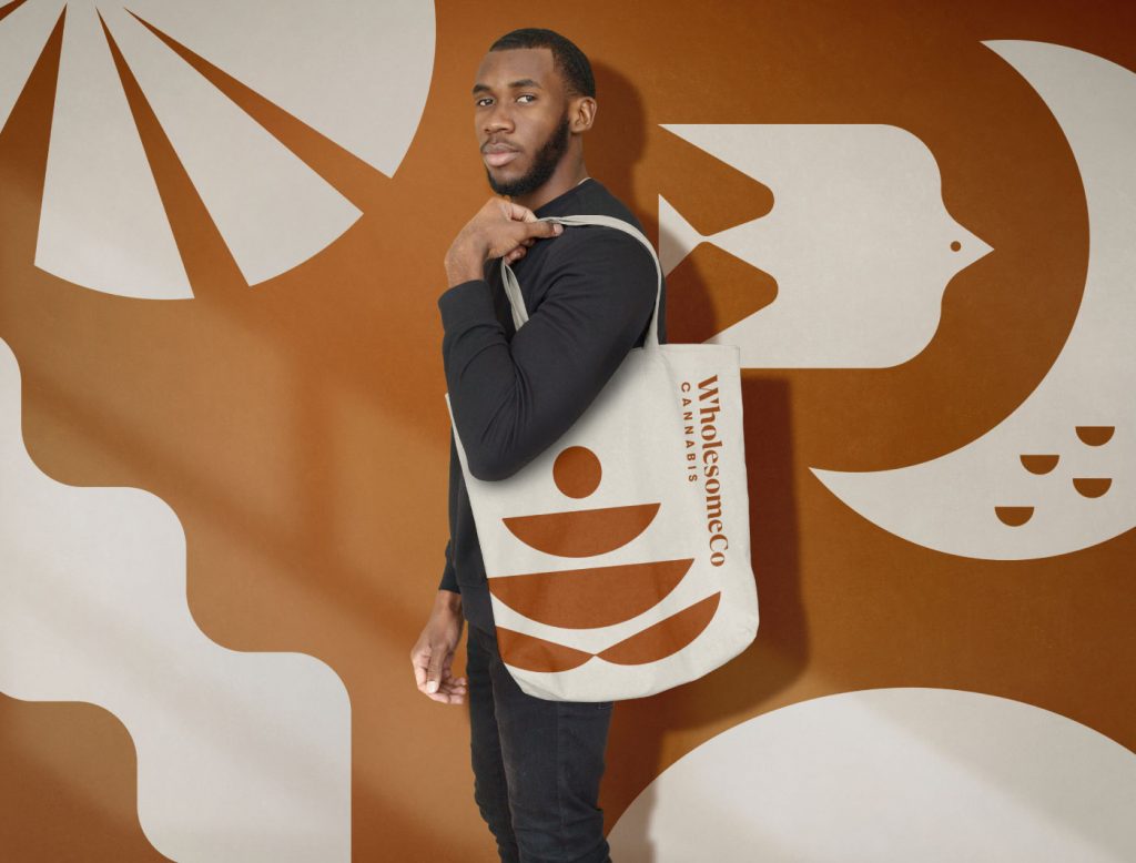
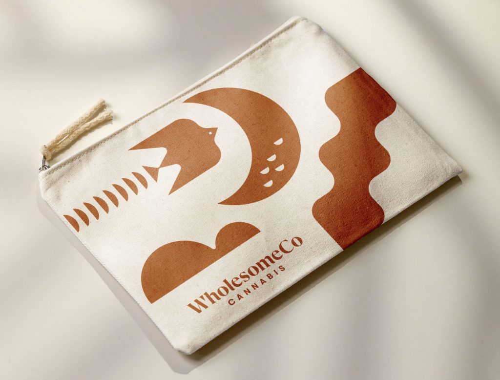
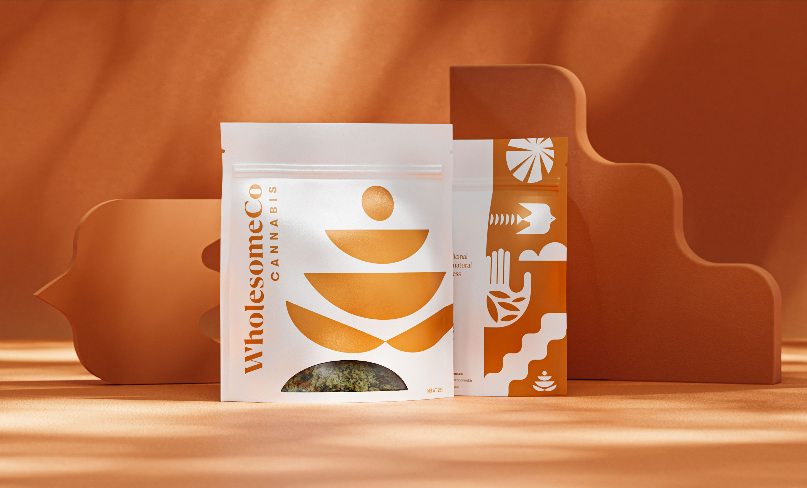
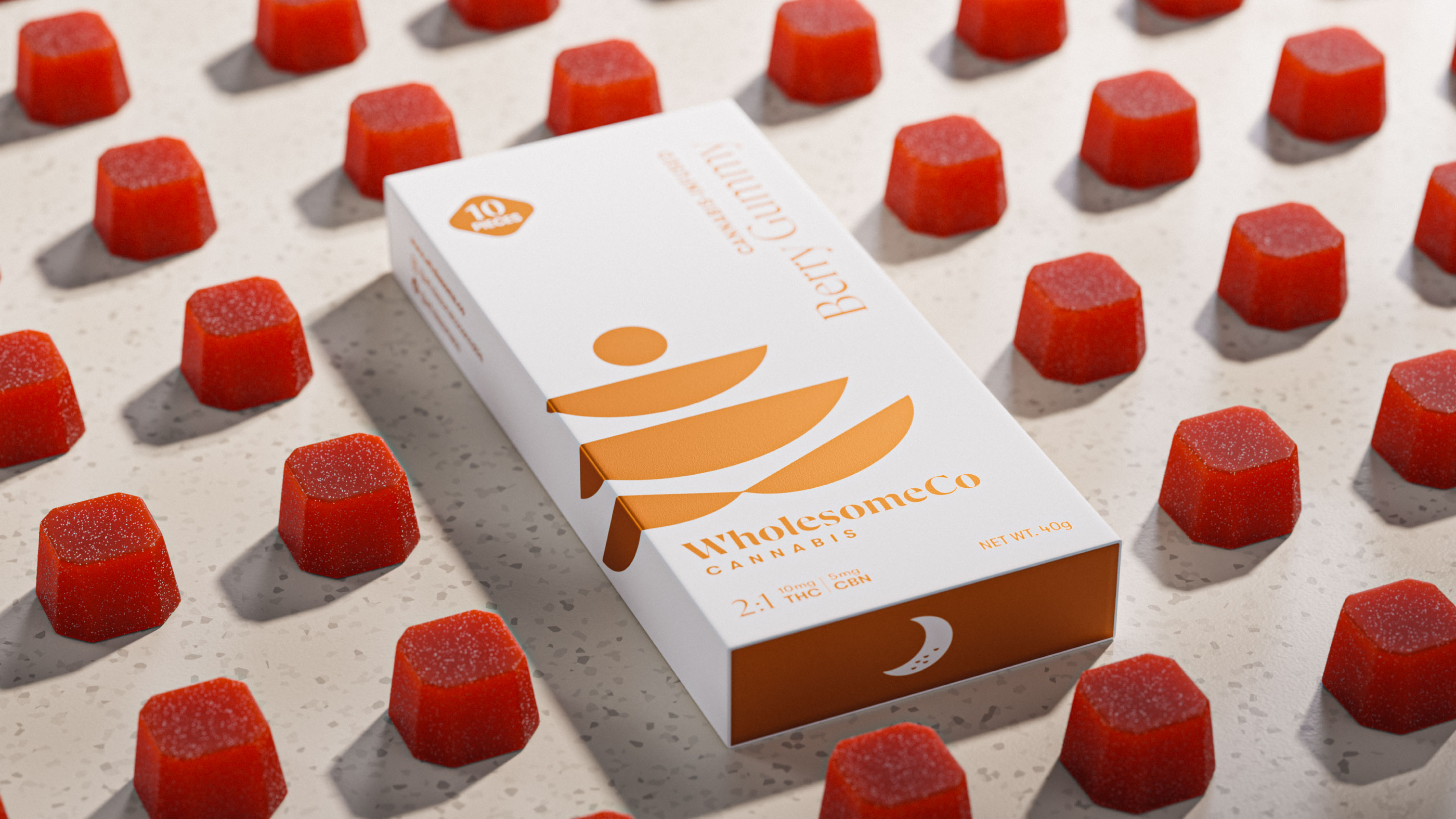
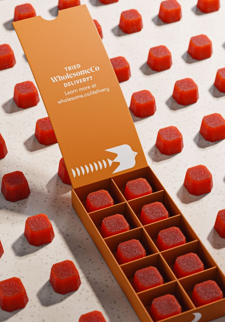
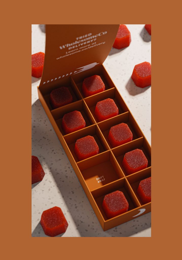
A custom packaging system was vital within the clients brand story. WholesomeCo not only has a retail space but also delivers product throughout the Salt Lake City region. The packaging system was a crucial way of reinforcing the brand’s story long after a purchase. Throughout the identity and packaging system we implemented iconography that abstractly speaks to the wellness benefits of cannabis. The bird used throughout the brand system symbolizes hope, rebirth and freedom. The sun, a common symbol for energy, positivity and self. Where the open palm historically represents truth, honesty and creativity. Within our open palm icon we have placed abstract leaves connecting it back to WholesomeCo and their product.
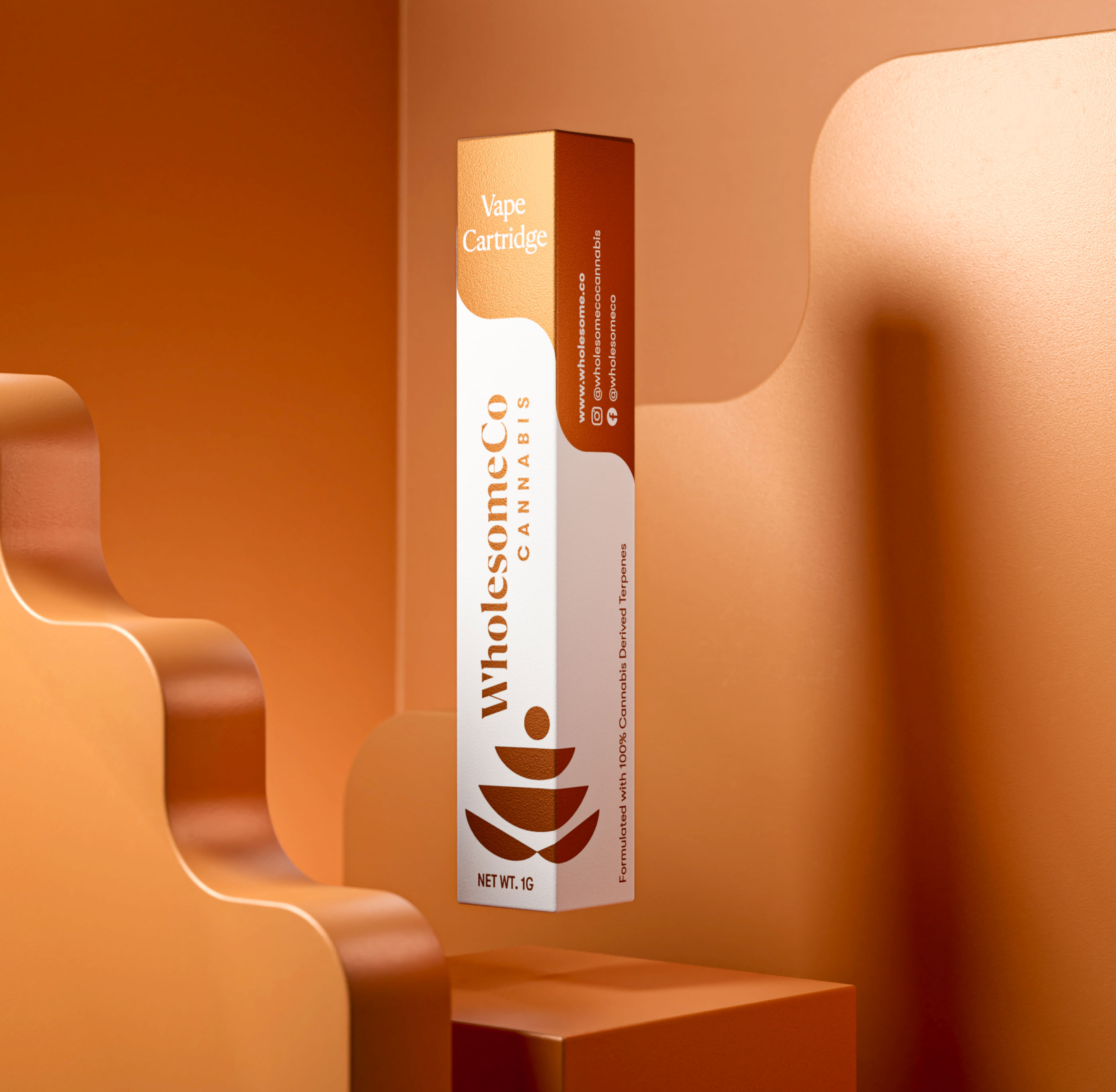
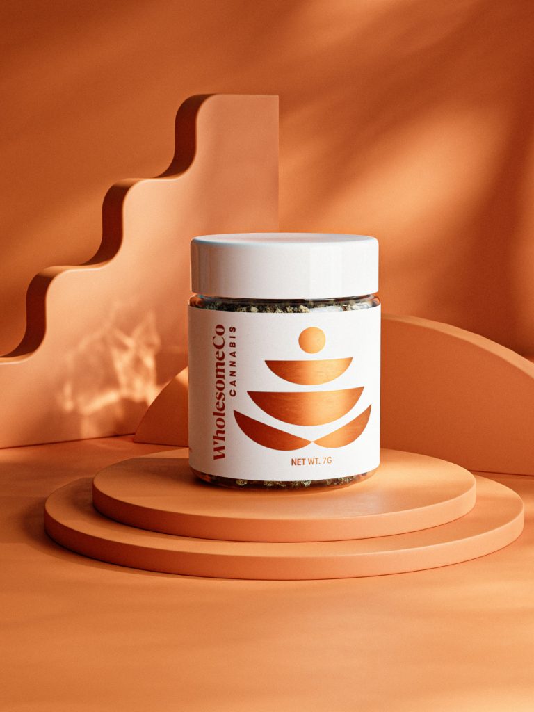
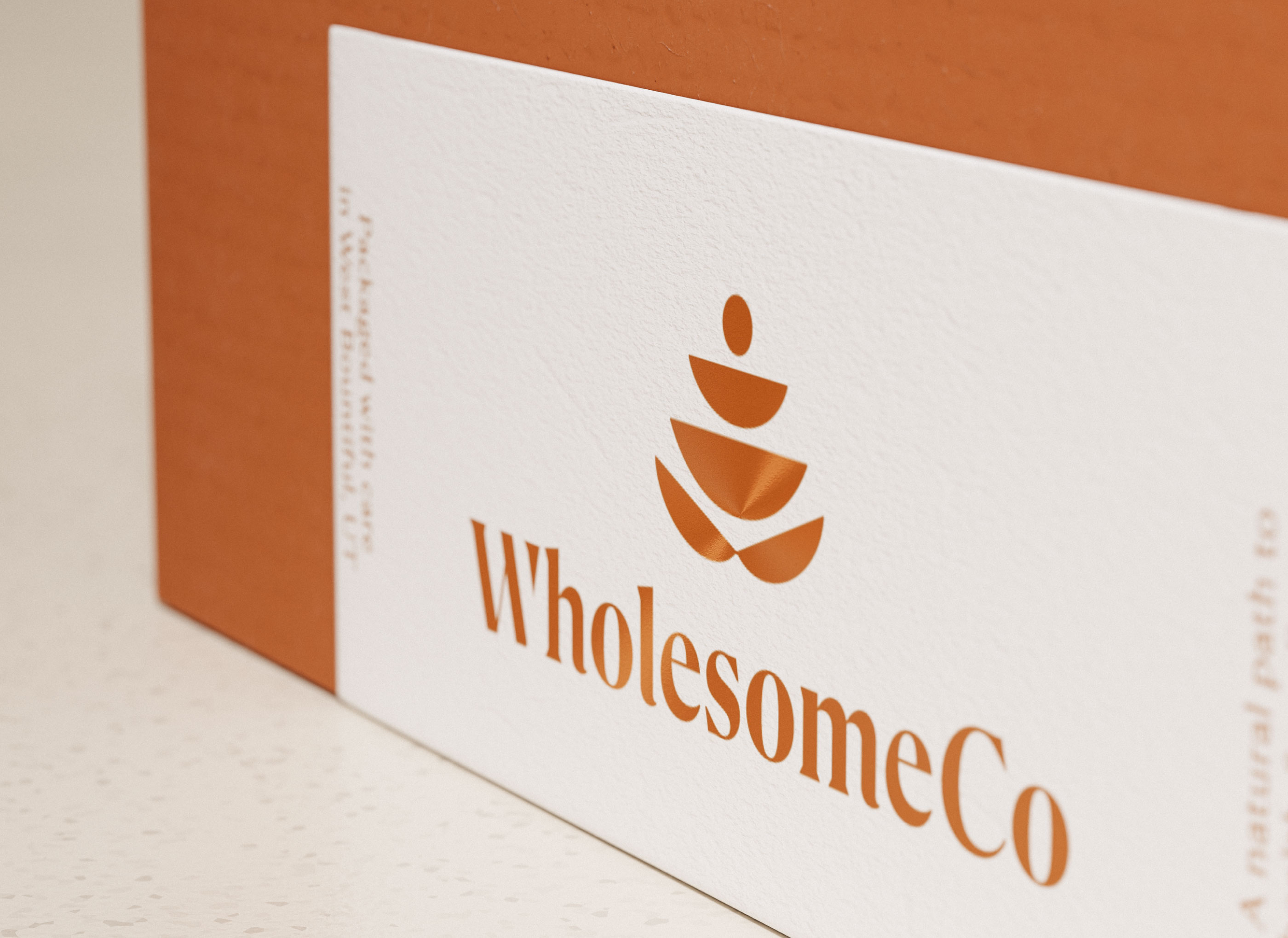
The color palette used in the brand was designed to evoke the Utah landscape. Many believe that the color copper represents spiritual richness and abundance. The use of metallic copper and the simple palette choice reinforce the clients transparent and trusted approach to cannabis.
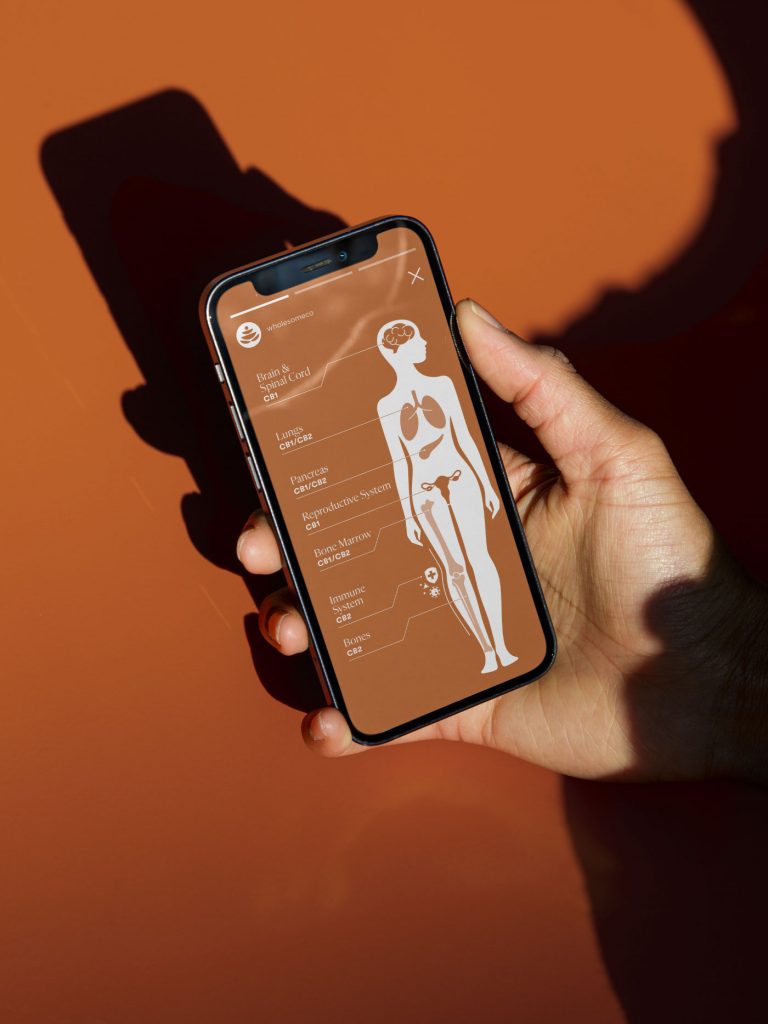
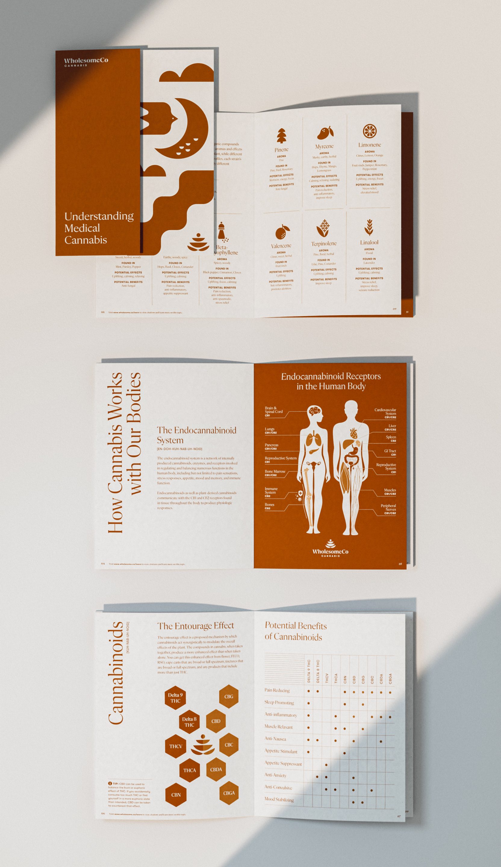
WholesomeCo is a passion brought to life through education and expedition. WholesomeCo supports their consumers by supplying them with the resources to help inform and empower their choices on their personal health journey. Education has been a core value from the very start for our client. To help with this objective, our team created various applications that broke down their offerings and benefits in simple terms. These tools help WholesomeCo overcome stigmas around cannabis and help consumers understanding how cannabis can genuinely change their lives for the better.


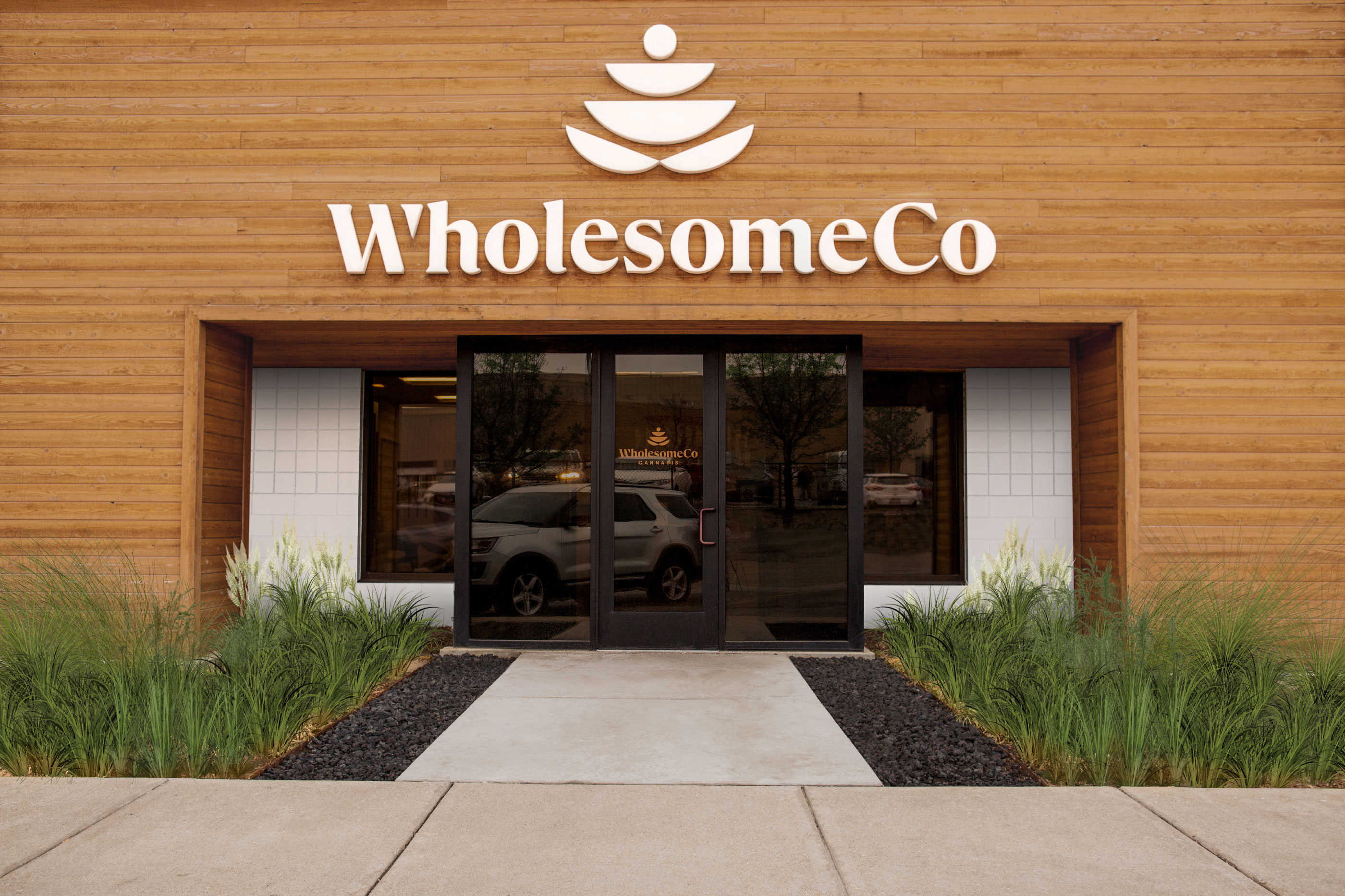
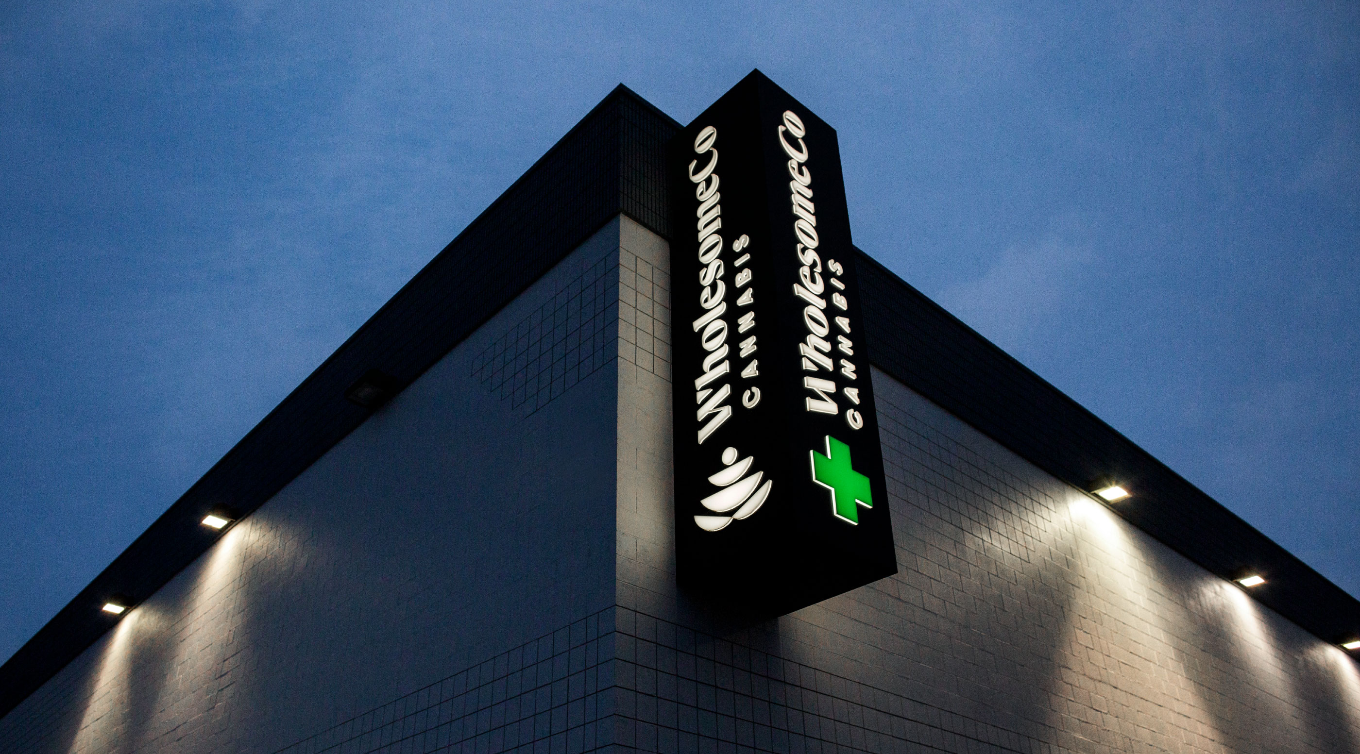
With the retail experience we wanted to create a signage and hospitality system that is clean, simple and warm. When you visit WholesomeCo the experience should speak to the quality of WholesomeCo’s products and the approachable staff who are there to assist and educate you. The warm wood mixed with the dimensional white signage have the perfect balance between modern and organic—essentially WholesomeCo’s approach to health and wellness.