Publix Cereal Line
PACKAGING SYSTEM
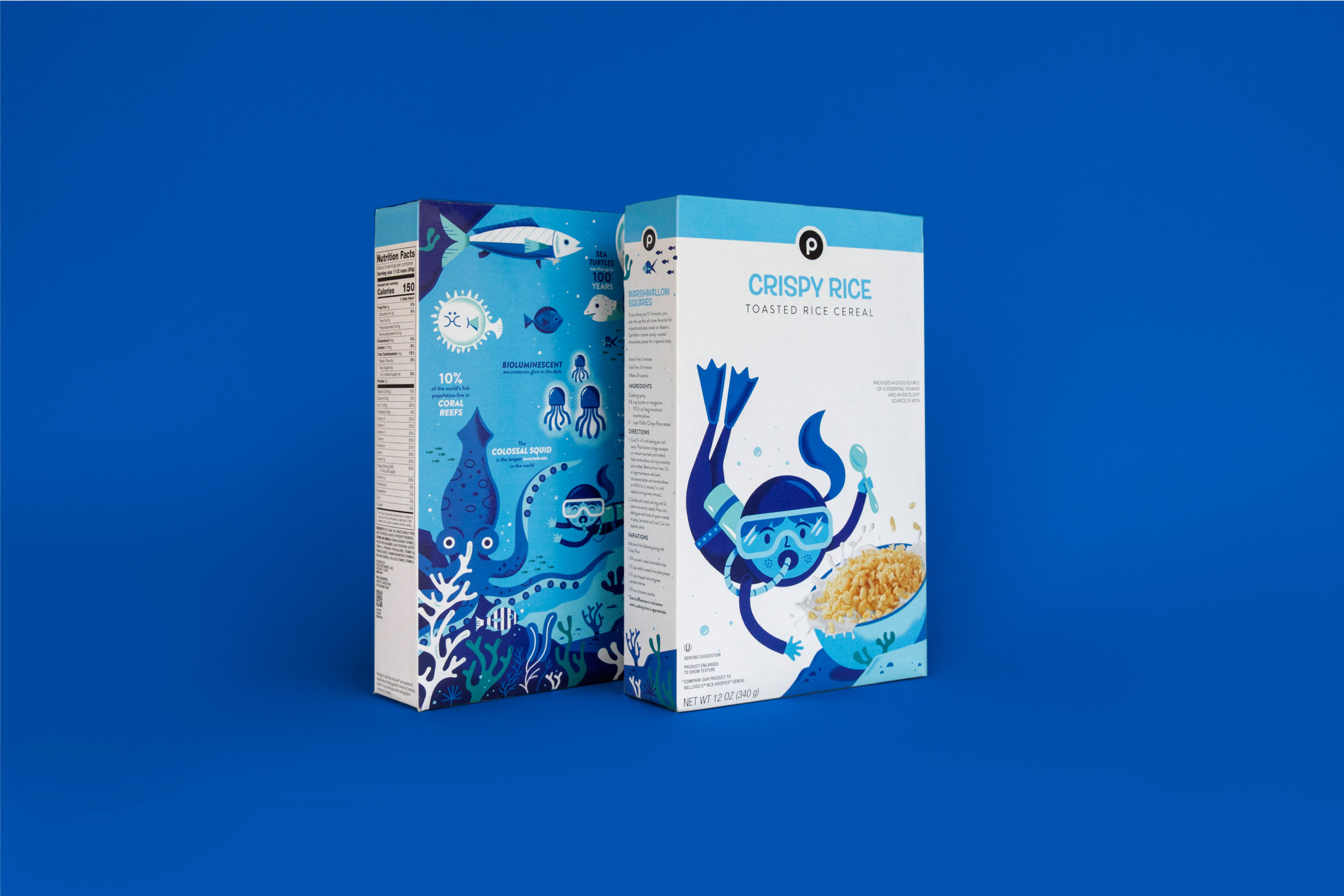
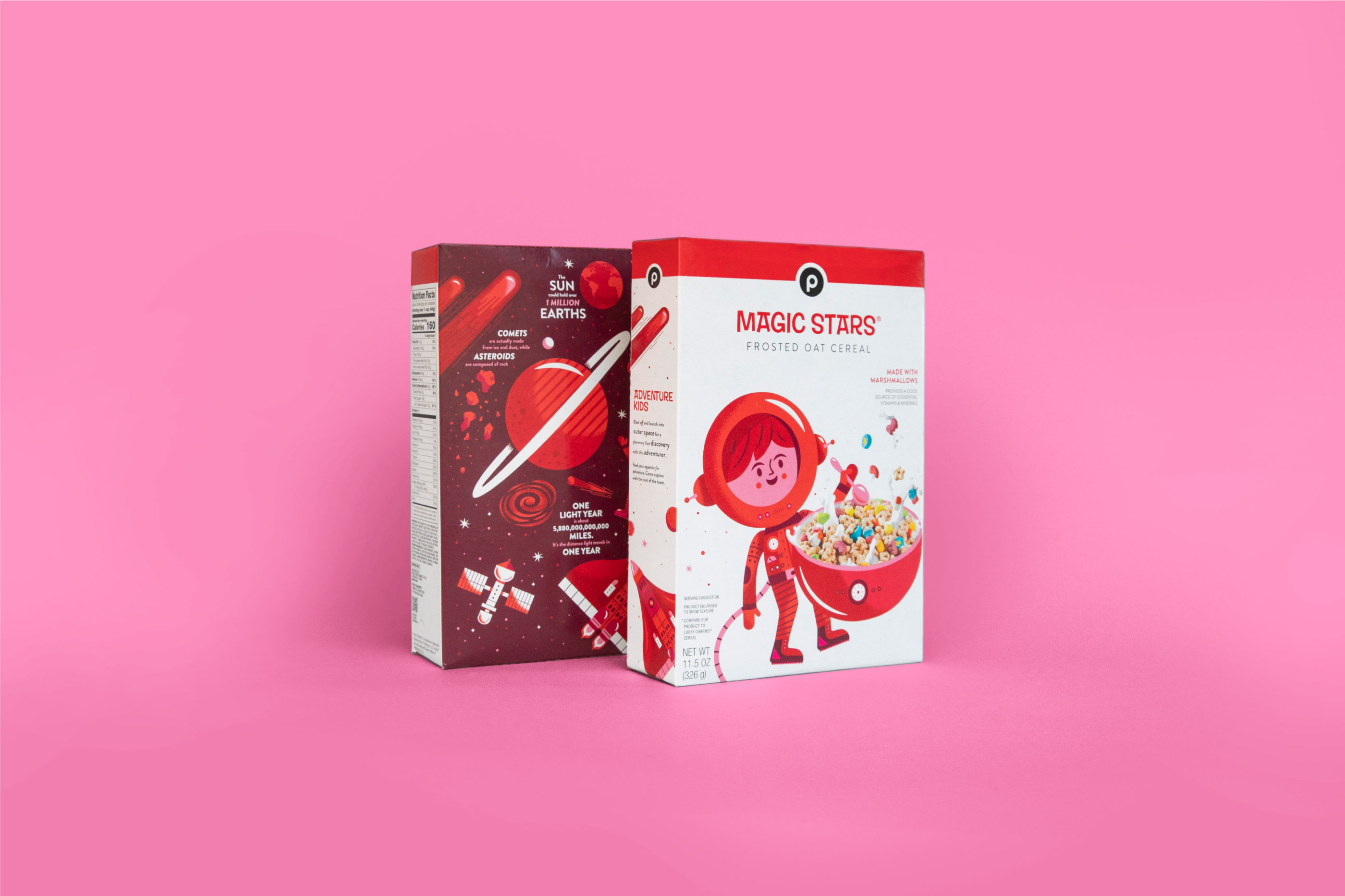
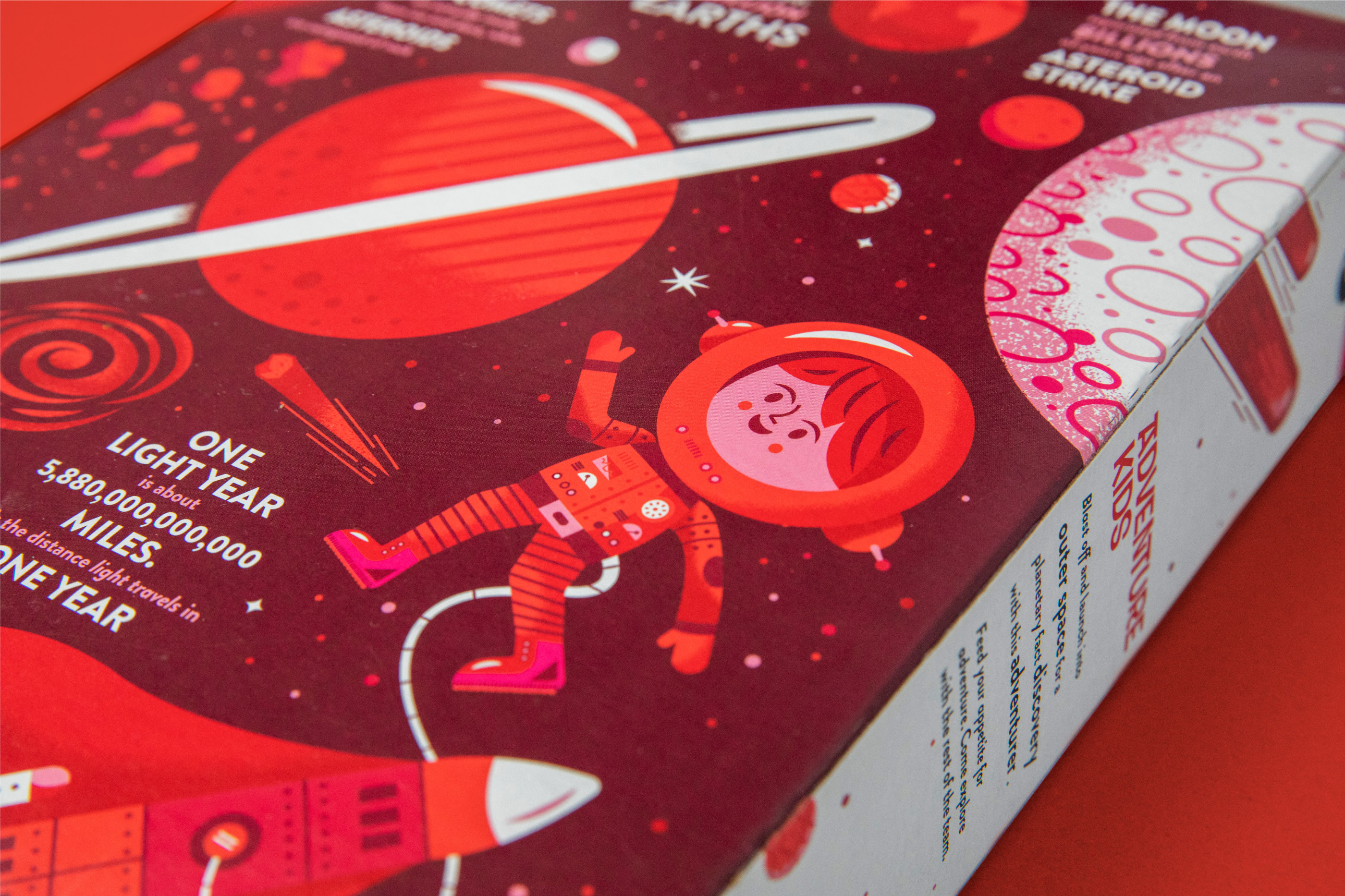
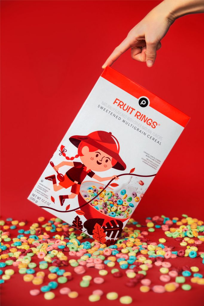
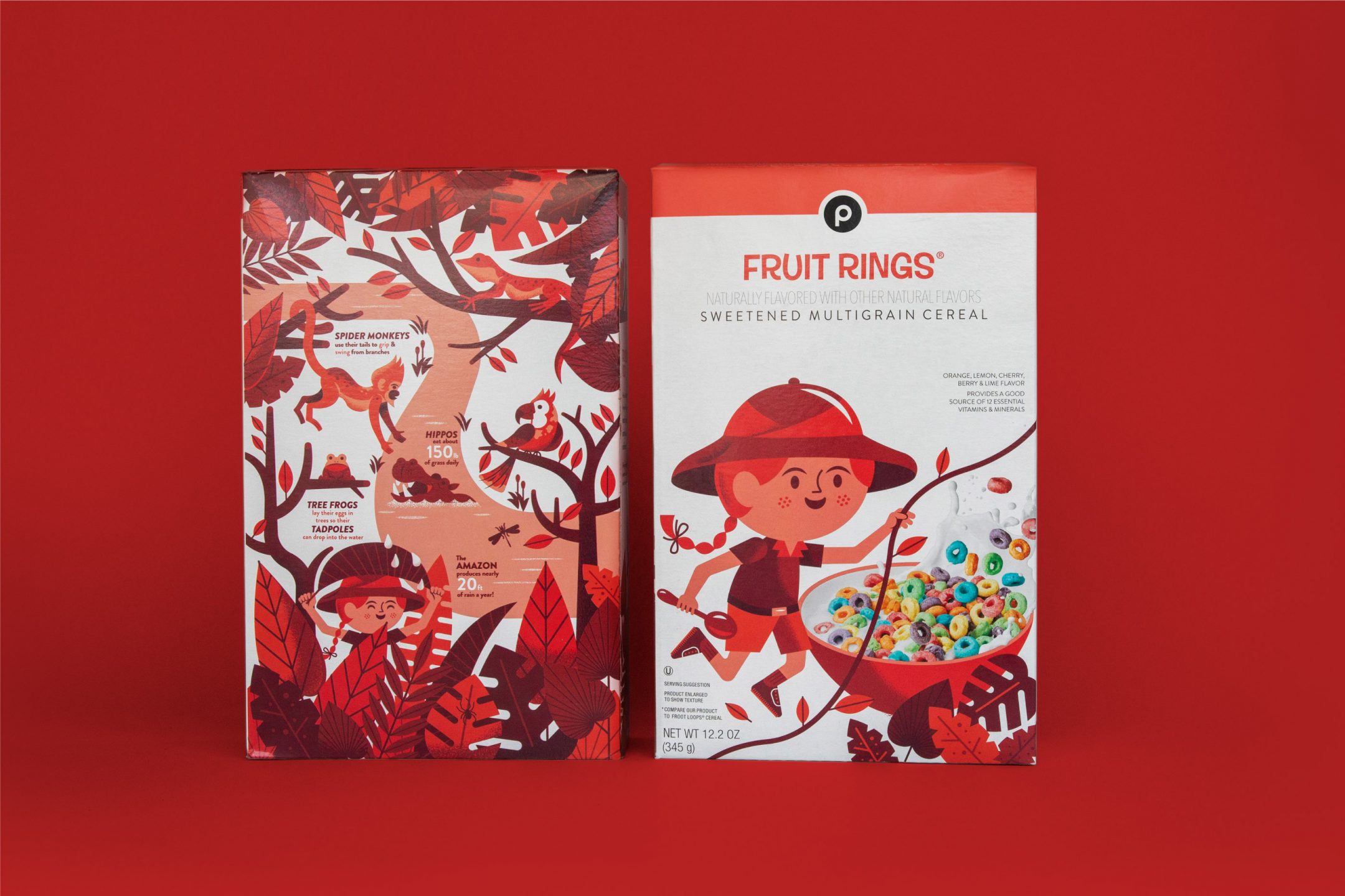
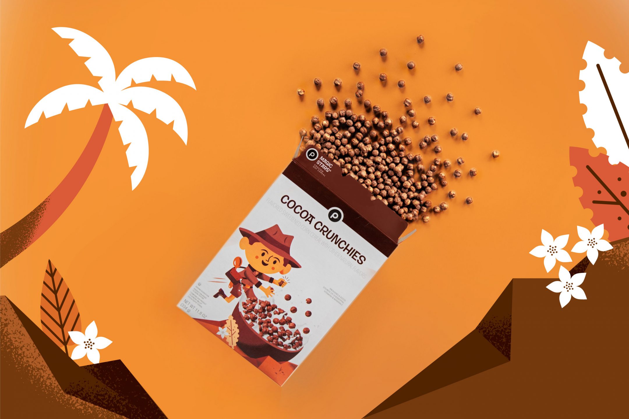
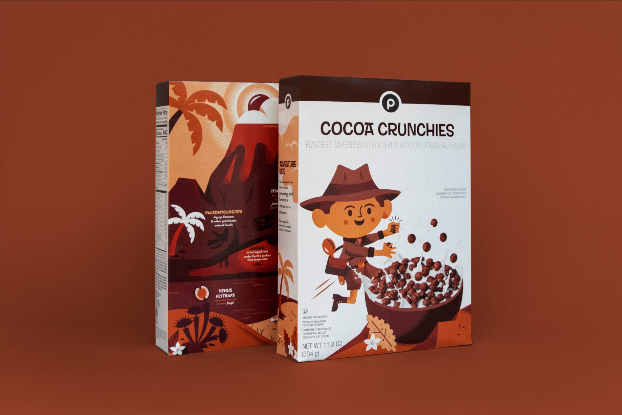
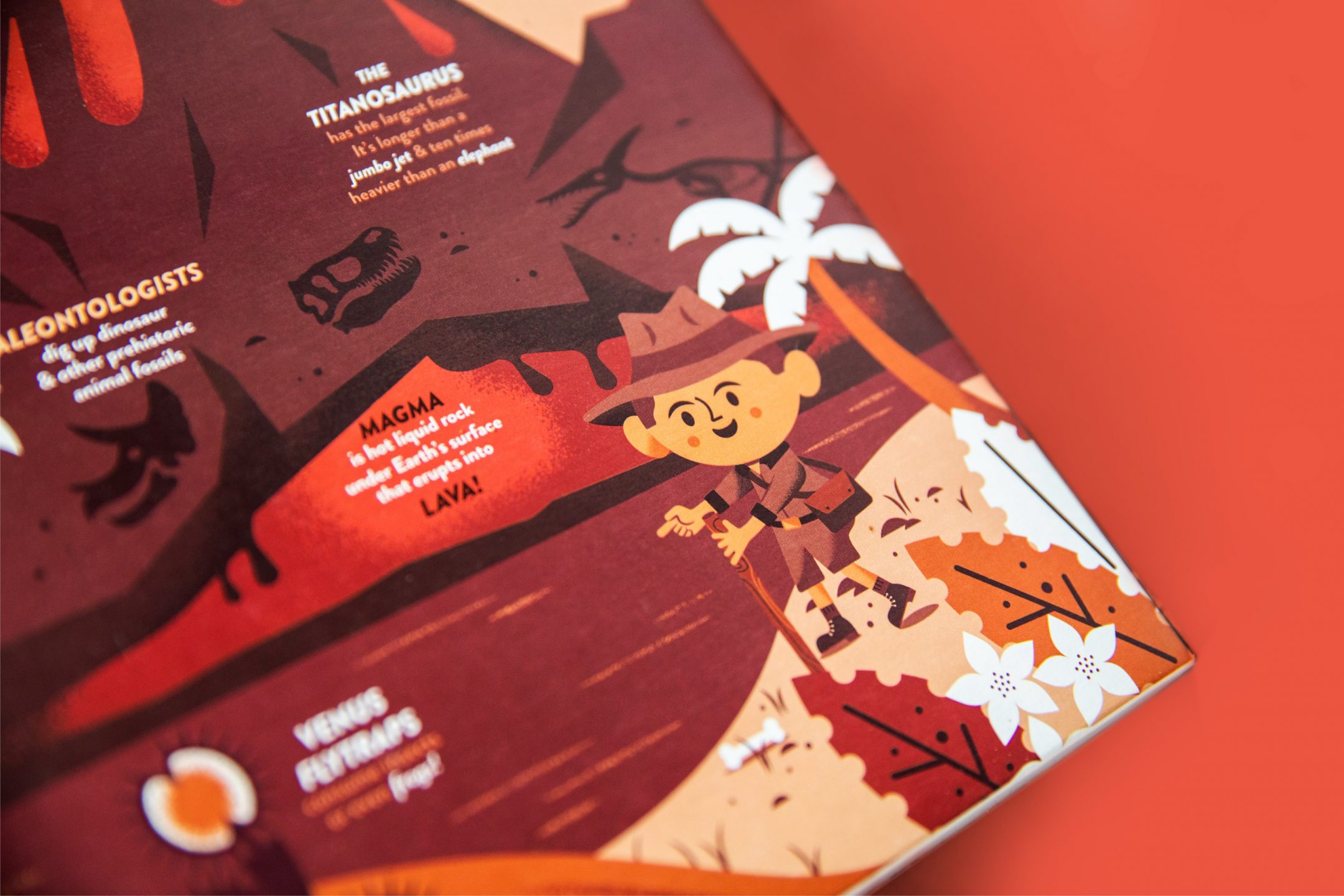
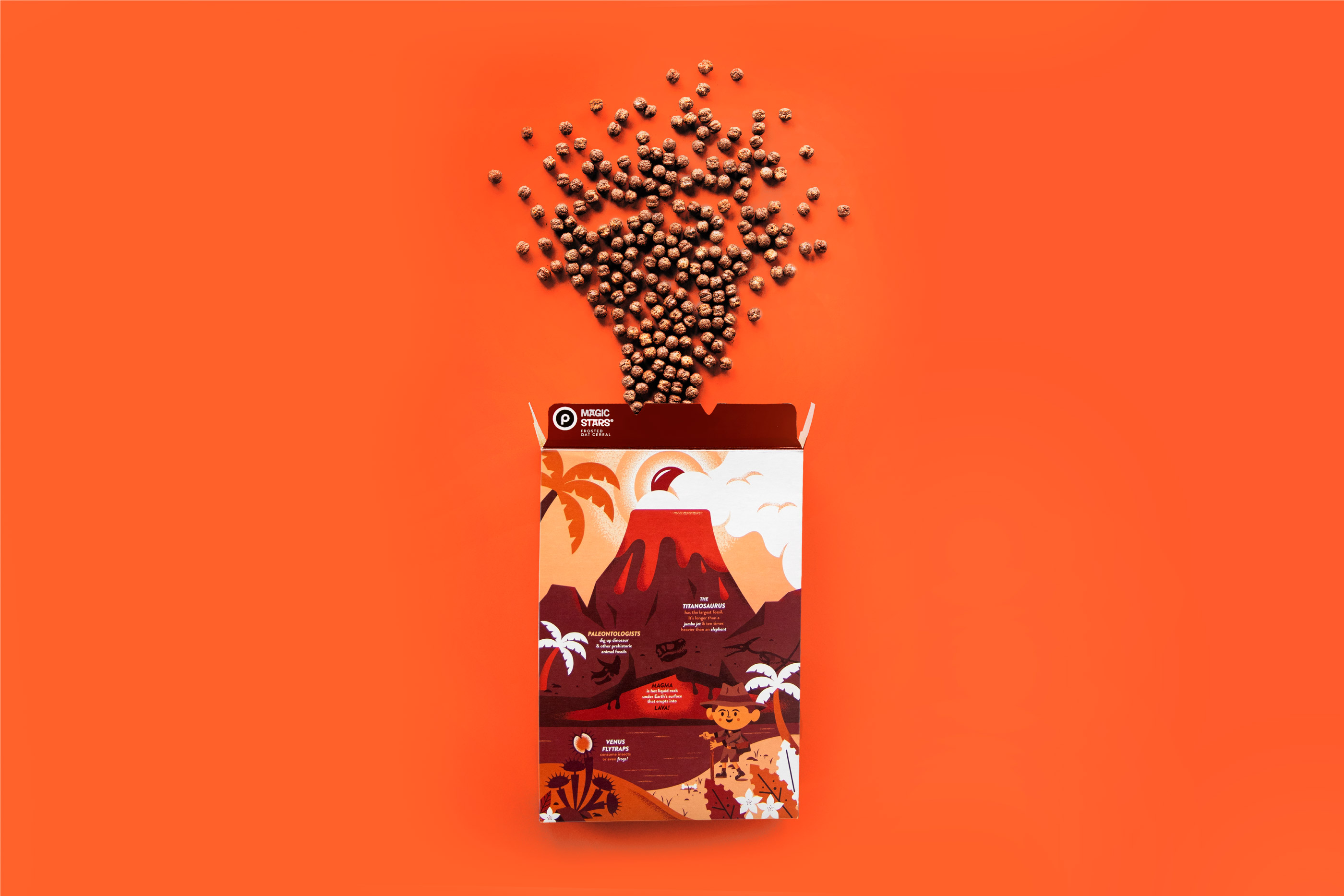
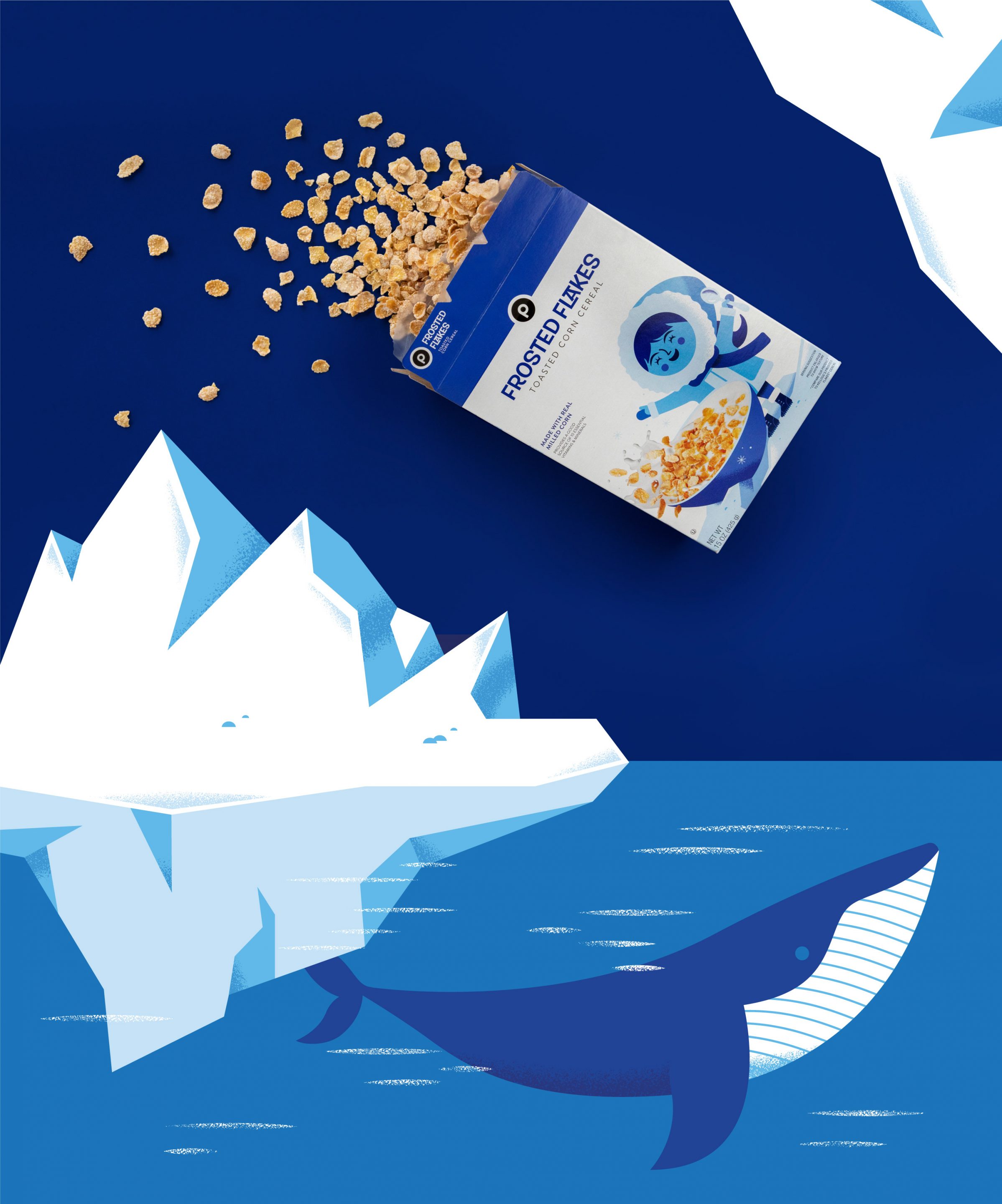
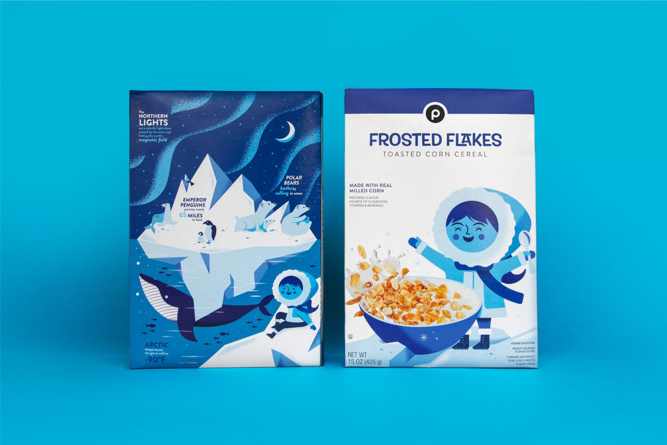
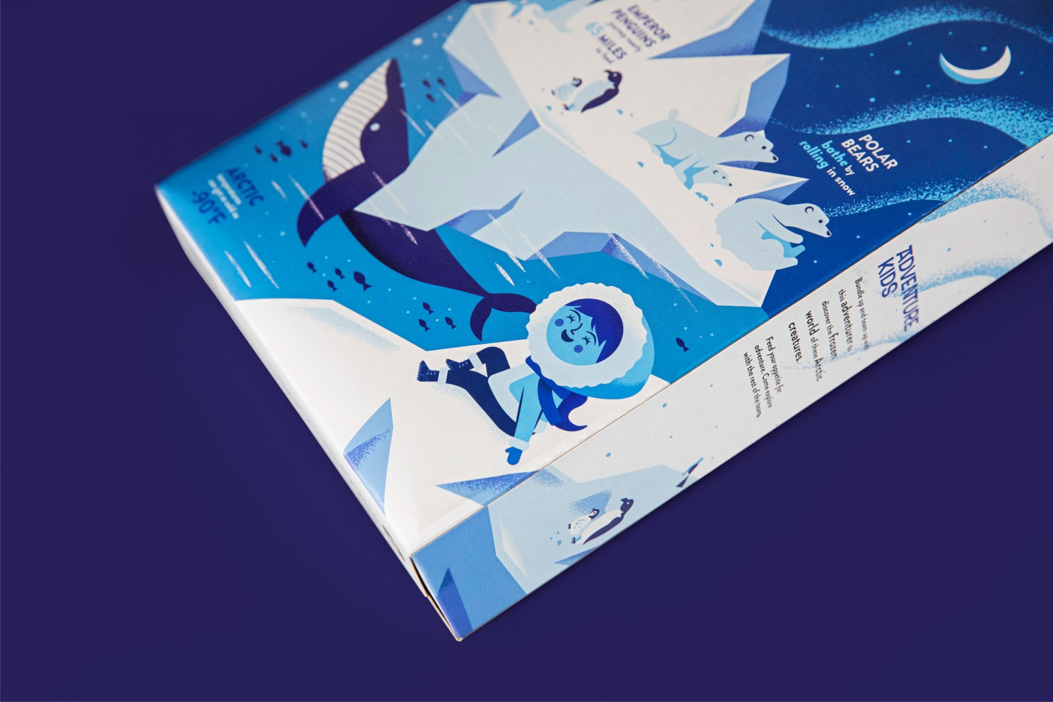
Come feed your appetite for adventure. We were brought on by the amazing creative team at Periscope and Publix Super Markets to developed the visual identity, overall illustration library and packaging system for a proprietary cereal line. The Adventure Kid program includes six proprietary cereals—each showcasing a different adventurer on the front of the packaging and a different environment kids can explore on the back. The system we developed for the cereal line has set a standard that continues to expand to other food categories at Publix.

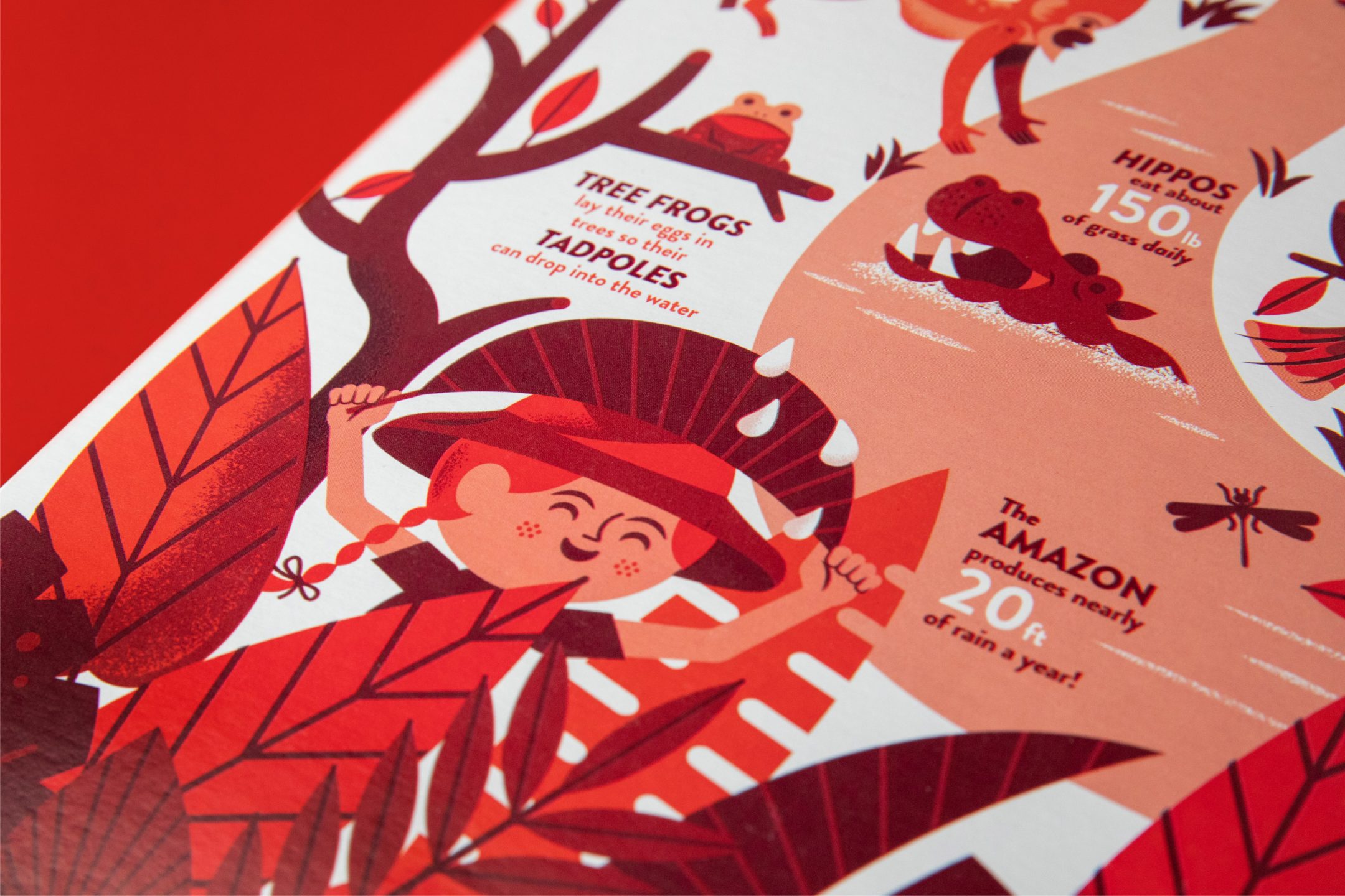
The goal in creating this line of products was to invoke a strong sense of adventure, wonder and whimsy. Not only should this packaging be visually appealing but it should educate, encourage and tell a story. We wanted this packaging to encourage kids to learn more about the magnificent world around us. Each cereal packaging showcases a unique environment, sharing information on what makes it so memorable.

Our goal was to create a system that translated beyond the food packaging to advertising, POP displays, digital marketing and future proprietary Publix food products. Publix Super Markets has over 1,200 stores across the United States. The visual system we developed had to be clear and easily adaptable to the growing super markets diverse needs.
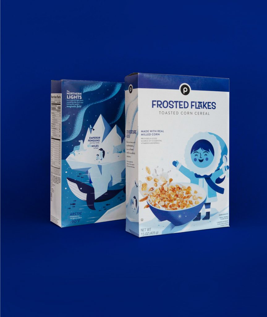

“The strong use of white on the packaging was consistent with Publix’s proprietary brand but also helped the kids cereal jump off the shelf and cut through the clutter and chaos of the competition.”

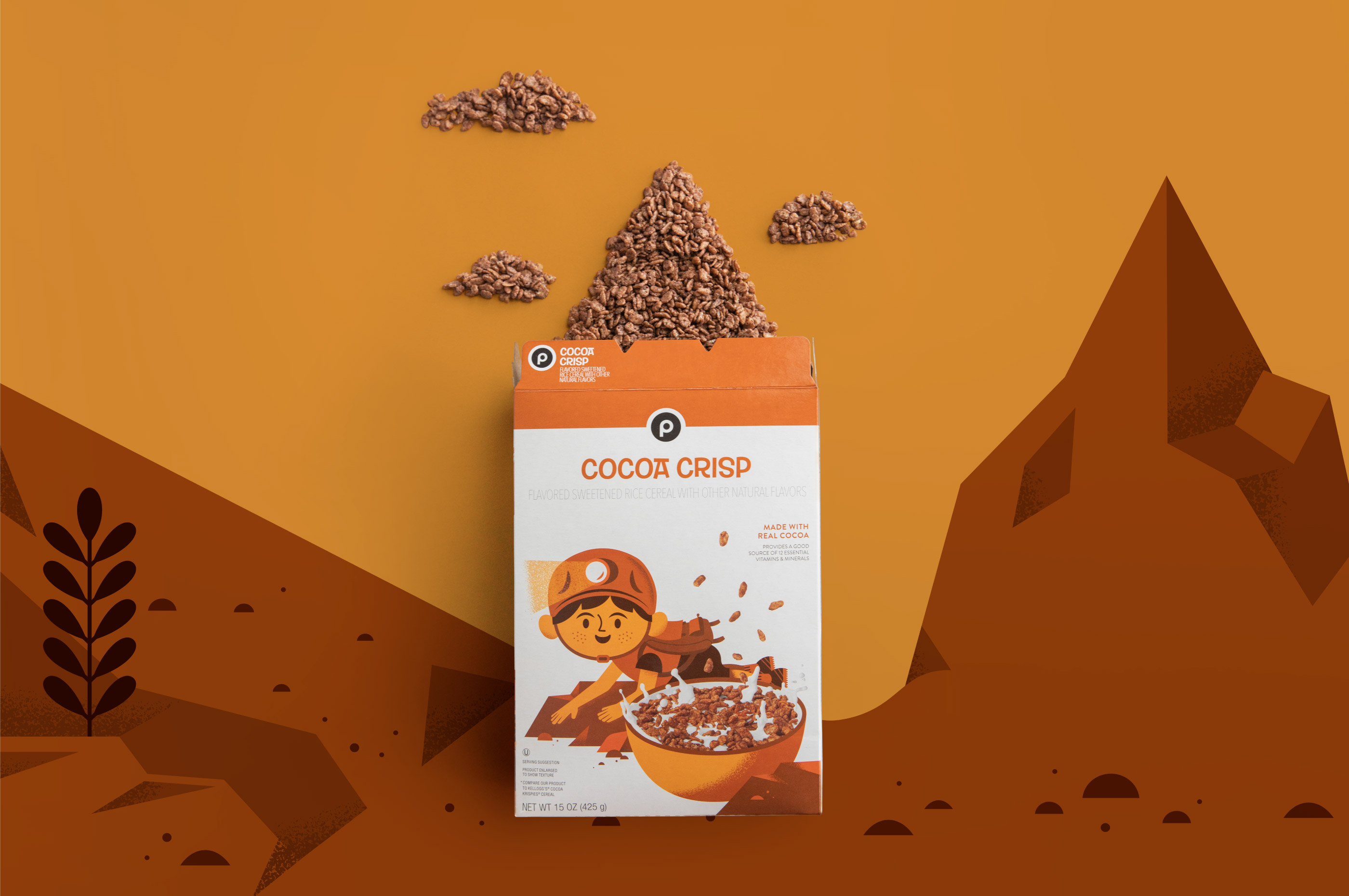


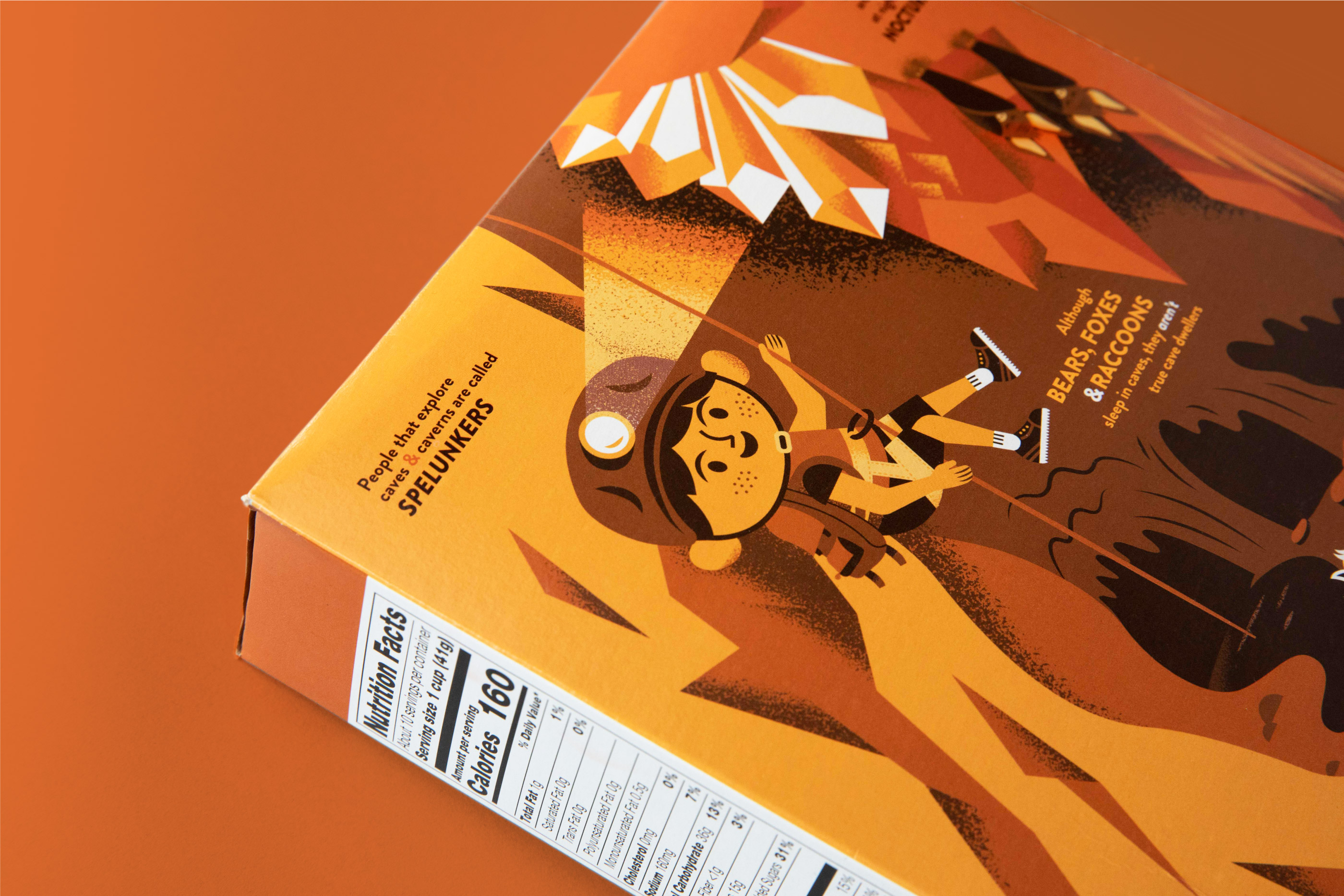
Packaging design is the last touch point for clients to reach consumers. The shelf presence needs to be clear, authentic and convey a sense of adventure and wonder—part of Publix’s overall core value for this product line. Eating cereal should be delicious and create an opportunity for discussion. Above all else, it should be fun.